


Great landscape photographs require the skill of a number of artistic and technical ideas brought together. One issue is the employment of the art elements using ideas of light, color, line, and circular observation. A second idea is that the landscape image will be loosely evaluated by the twelve elements of a merit image as well as its believability. A third importance is the photographer’s mastery with the camera to communicate an idea with emotions that follow a technical set of ideas. Finally, the photographer must set his/her emotional previsualized results and consider which of the techniques of camera settings, previsualization, and ideological approach will best evoke the desired emotional response. These four considerations will help determine the landscape image appeal.
The above image demonstrates how it all works. While driving through Yosemite National Park, I noticed a stand of trees that had a beautiful backdrop of pines, mountains, and sky interest. I saw and felt the loneness of the subject birch trees among the grandeur of pines, mountains, and sky. My heart began to race with rapturous excitement, so I grabbed my equipment and rushed quietly to the scene for tripod placement. The light on my subject was in good position with the clouds forming a strong backlight… a winning condition. The contrast of the subject in the scene was there to make my subject birch trees stand out among the enormous pine and granite display. Liking what I saw, I chose my 50mm prime lens and selected my tripod height by viewing the scene through my camera first and following my feelings. Because the foreground was not particularly noteworthy, I aimed my camera up at the interesting sky and asked myself, “Do I have something of interest in all four quadrants of my composition?” This is called Quadrant Theory.
 Next, I composed the scene by raising and lowering the camera height and placing the birch trees in an aesthetic center of interest. When satisfied, I set the lens aperture at f11, the sweet spot for that lens, and focused one-third the distance into the scene. Then, with my hand atop the camera, which is on the tripod, I pushed down the shutter snap. There are a ton of technical decisions to make when approaching a scene like this. So, to minimize the number of decisions which can distract from the purpose to communicate something of the subject, I pre-prepare the camera before arriving. The shutter release cable is affixed to the camera body with the mirror-up option selected and the camera is mounted on the tripod. In my camera vest, there is a two-stop graduated neutral density filter and a circular polarizer for the prime lens of choice.
The Quadrant Theory is a good place to start when communicating the scene. Is there something of interest in each of the four equally divided quadrants of the frame? Next, keep in mind that viewers will probably enter your composition at the bottom-left third, unless forced elsewhere. Now choose one of the compositional theories that appear closest to what you are seeing in your viewfinder and place your subject at the intersection point.
Every step affirms decision-making choices while recording the landscape. You may decide to use a circular polarizer to capture more drama in the sky or to see more cloud contrast. The choice of using a graduated neutral density filter may be determined by asking whether or not there is a balance of tones from top to bottom of the composition or if something needs to be darkened to reduce its distraction from the subject. Setting the exposure also helps communicate your feelings of the scene. If left in auto mode, you will automatically get what everybody else gets. Normal things are rarely inviting when it comes to imagery. The manual mode allows the photographer to influence the image as light and airy, or intensified colors due to darkening the surroundings, or dark and mysterious or even jubilant ascensions by allowing the eyes to follow a path straight up.
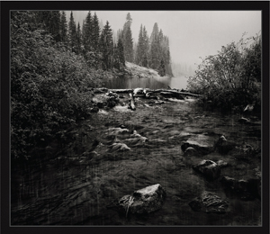
Subject composition is the key to a great image by influencing its ability to be remembered. “When Rain Turns to Snow” has an “s-curve” through the water that begins at the beaver dam and flows to the bottom-left of the frame. Notice that the viewer’s eye movement does not allow exit from the image. There are no high-contrast objects near an edge, there are no vertical/horizontal line intersections close to an edge, and there are no out of key elements around the edge. There is only interest.
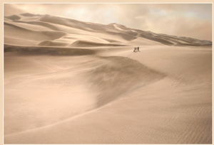 In the image to the right, the gathered friends are placed in the “Rule of Thirds.” Their shape creates a gentle diagonal, which is the third strongest compositional form. The sands of time are in movement while the subject’s stillness expresses the title of “Time for What Really Matters.” Also, notice that the cool colors do not exceed .382 of the scene. This is important because equal balance is not appreciable. The composition that normally exists in nature is .618 and its inverse. Mathematical rhythms do influence vision preference.
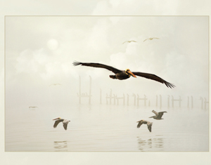
In “Sundown Over Southfork,” the horizon line is not allowed to occupy the middle of the picture. It is good for nothing other than passing the viewer’s eye from one side of the image onto the other side. A “dead center” is just that… dead and at the center… and good for nothing. Rarely is a scene perfectly balanced with exact symmetry on both divisions of the image.
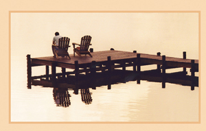 A near monotonous appearance of the scene on the gulf helps to influence the idea of “Alone in the Silence.” The unused chair highlights the fact that the subject is alone. The image has multiple appeals because it allows multiple inflections into what is happening in the photograph. Most would see the man as slumped shoulders and in despair of his situation because he is facing outward on the left edge of the image. It is silent with still waters, yet warm and inviting. The subtle painting technique employed on the wood helps to shift emphasis away from the dock and onto the man.
 Previsualization of statement is important to anticipate the emotion the photograph emits. For instance, fog enhances the unknowing of the future. Sand enhances the idea of time comparison. Still waters enhance the quietness of thought. Waiting enhances anticipation. Cool colors are filled with thoughtful reflectance. Yes, symbols are used in everyday communication and far exceed the ability of description for universal acceptance.
Anticipating outcome is more than ideological thought. It relates to physical things like gear planning, image presentation, predictive movement, composition employment, color rendering, contrast control, light recognition, circular flow, maintained asymmetry, and deliberate statement. The best way to previsualization is to put self into the scene and imagine what you want to say… then pursue that.
Where to Put the Horizon Line? – No discussion of scenic landscapes would be complete without a discussion of where to place the horizon line. Remember, that of all the compositional strength shapes that the horizontal line is the very bottom of the list of shapes. It is the most static and requires repeating its shape at least eleven times to gain any visual interest of its own. As it turns out, the horizon line is good for nothing more than passing the viewer’s eye from one side of the image onto the other side. It might be best to capture a scene without a horizon line in it. However, and realistically, there is at least an implied horizon line to draw the mind. Whether the image presents an actual or virtual horizon line, it serves to distract while it offers an eye path. The horizon line is so subtle that it can lend to the aura of feeling derived from depth ploy. When a broken or shortened horizontal line exists in the image the eye is pulled from subject to that place and can serve to add the perception of depth in the image. Consideration of the horizon line placement is valuable.
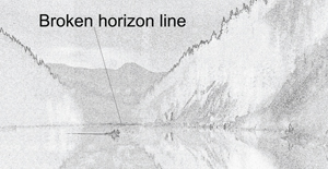 Here is an illustration of horizon line placement with the image “Sundown Over Southfork.” For an image that has upper or sky interest, a lower horizon line is best. It lends the differential vertical ascension to the viewing pattern and causes better evolvement with the rest of the image. For a scene that has great foreground interest, the horizon line should be placed in the upper part of the capture. This allows for the natural vertical ascension movement to heighten the full contact with the rest of the scene. The subtlety of recommending eye movement does not exist with exact middle placement of the horizon line and requires other eye movement devises to suggest movement. Good placement of the horizon or its virtual counterpart would be at thirds, fifths, .618 from the top or bottom, ninths, or anyplace other than dead center.
 4 Movement, Circular Observation, Parallelism, Primary-Secondary Subject – The aesthetics of eye movement has another occurrence beyond where to place the horizon line in an image. Vertical and horizontal “t” movements also help maintain viewer activity into the piece. It is imperative that the viewer cross the middle lines, vertical and horizontal dimensions, multiple times to maintain involvement. Usually the longer dimension is searched first, and then the shorter dimension with alternating views appearing next. Those middle lines should not include either the horizon or a strong vertical in dead center. If it does it will divide the viewer and interest will usually be lost. It is both unnatural and a poor use of negative space that repulses the mind.
A “4 Movement” action occurs when the eye ascends to the top of the image, then diagonally down and left to the horizon, then to the right side, and then back up again while surveying the whole image. The “4” movements actually imply a diagonal movement also because the mind wanders to connect the vertical-horizontal progression.
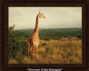 Primary and secondary subject placement ideas are used to engage the viewer for inclusion into the scene. “Overseer of the Kitengela” illustrates this idea. The giraffe is the primary subject while the group of zebras is the secondary subject. The link of two subjects is helpful for communicating their inter dependence upon each other. The giraffe has good vision for protection from predators while the zebras smell out predators that the giraffe cannot. Together as a unit they are safer.
All four movement theories of circular observation, “t” movement, parallelism, and primary –secondary subject placement ideas rely on uninterrupted eye movements. Interruptions occur when a distraction is introduced to the balance of the scene by inclusion of a distraction. Distraction avoidance becomes necessary when retouching the scene or capturing the image so as to not disturb the vertical-horizontal eye polarity created from horizontal line placement.
 John Murray, Master Photographer and Photographic Craftsman, is a second generation photographer following his father, Paul Murray, who pursued portraiture as a business since 1948. He is well-known in the industry as a knowledgeable critic used by the Masters while helping many of them achieve their degrees from PPA. John is one of the first to hold the “Excellence In Imaging Award” presented by the Professional Photographers of America.


