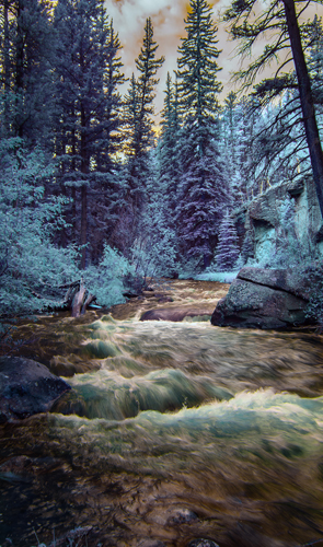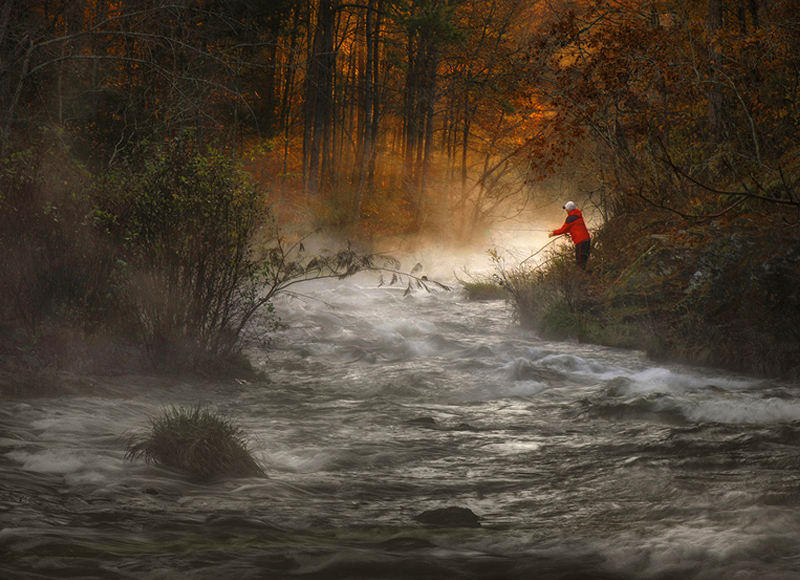
Achieving dynamic energy in Landscapes can be accomplished by considering a few things like light appeal, vantage point, color harmony, spatial line, and spherical aberration.
Choosing a vantage point can be tricky, yet deliberate. I like to look North or South in the morning or evening, East at sunrise, and West at sundown. The prettiest scene in the most picturesque place will lack emotion with the wrong lighting direction, no matter how inspiring the beautiful scene that lies before the eyes. When the sun is at your back, it is probably more picturesque to turn the other direction for photographic concentration.
The emotion of light appeal has an order of attraction. The strongest condition is facing directly into the controlling light of the image. Translucency is revealed because of wrap around light on both sides of the objects photographed. The next best allure is side light. As light illuminates the highlight and its shadow lends depth and shape to the beauty of an object. Finally, camera-positioned light often flattens an image and destroys it depth as highlights and shadows are bunched together into a close formation. This lighting condition does however reveal color as seen in the image of the flower. (Below)
The choice to present the scene in color or as black and white is based upon whether the focused scene has a color harmony or needs dramatic presentation inherent in black and white extreme. There are seven harmony schemes, although only five schemes are recognizable at a scene. The five easily recognizable schemes are monotonous (same color), complimentary (opposite), split complimentary (two opposing one), triadic color harmony (three equidistant), and analogous (along-side of) color schemes. Those schemes that use four or more colors like the tetrad (two opposites) and square are extremely hard to see while on location and require too much undistracted concentration.
There are many other choices to be considered at the pressing moment. If the undertaking purveyance has too many colors, it will better be served by presenting the image as black and white which allow concentration on its contrast of tones. Good images require slight detail in both highlights and detail. In other words, try to illuminate blown out sky and black shadow.
Linear regression of lines and spatial planes are good allies for representing depth and aid the eye with flow pattern. So too does atmospheric hazing and blue-ing. Trees, roads, borders, brush, and flowers all make interest points for recession. The viewing of change is a powerful progression of purpose as seen in the image “Road That Leads Out of Here”.
Make a quick survey of your potential scene and either feel inspired and taken in or choose another view. The inspiring image is not so much about what you see; rather it’s about how you feel about what you see that matters. Feeling is communicated by observations like the emotion of light, color rendition, and eye flow movement of the scene. There are many patterns of eye flow movement that are affective. They include circular observation, upward/downward zig-zag, parallelism, primary-secondary subject recognition, and more.
A landscape image does have one major issue to overcome. Have you ever looked at a mountain scene, made an image of the scene, then upon looking at the capture, been totally unimpressed? The glass of the camera lens is doing something disadvantageous. Because of the convex nature of the glass to focus light onto the sensor for no light fall off at its edges and sharpness conformity approaching what vision has. So, it flattens the top of your image. It’s called spherical aberration and is working to rob the emotional impact of the scene.
To attack this thief, simply stretch the top of the image by pointing the camera lens downward on the shot to use the extreme top of the viewfinder. Then compensate by using aperture of f16 and focus one third the distance, the hyper focal distance, into your scene for both foreground and background sharpness. Often a higher vantage point is required by raising the camera position and stepping atop an automobile. A van roof, pickup bed, or ladder will do nicely. I usually use a circular polarizer or two stop graduated neutral density filter on the lens. This will give post processing leverage to increase levels without banding.
There are some creative options for landscape images that help lend impact. Millions of images lie within view every day. Seeing the same things, yet differently, can be effective for viewing interest. Sometimes a different approach is advantageous for the feel of the scene and the artist’s emotional projections onto the work.
Here are twenty six different approaches for “something that has been done before.” They include: infrared photography, long exposure image, filter use, inversion, photographic painting, light painting, flash use technique (color filtration variance), over-under exposure choice, willful white-balance change, toning application, multiple exposure, illustrative style, soft focus lens, paint technique overlay (sketch, cube-ism, Impressionism, pointillism, grain), intentional blur, soft focus, zoom movement, high speed freeze frame, spectrum narrowing, story- line presentation (leading progression, comparison dichotomy,
symbolic overlays (text, scrolls, light rays, imacons), framing, non-essential scene contrast change, soft focus lens use, and negative space conduction, and image space creation so as to work outside of that box.
higher vantage point is required by raising the camera position and
stepping atop automobile. A van roof, pickup bed, or ladder will do
nicely.
The list can be overwhelming, so the question of why becomes important once again. The aesthetics of what is happening when a technique is skillfully used will force comparison to the normal image and heighten the image impact because of change. After all, all of life is compared with change.
Considering methods is a very normal activity for application of craftsmanship. In my negative retouching days, I would decide what needed change and consider the best tool as brush or swab, whether to stipple using checks, xs, or dots. When evaluating the photographic print, I would consider enhancements by pencil, wet dye, chalk, or oil rub by the best-reason-of -use idea. It is only natural to use creativity by evaluation for photographic approach.
There are some helpful tips used in Photoshop that can eliminate some technical problems with image presentation. I still use an older version of Photoshop to avoid monthly fees. I give up much to do this but have found solutions around that. My newer cameras have RAW settings that my version of Photoshop can’t interpret. So I convert those files into 16bit by using Adobe DNG Converter as a Raw File Conversion tool. Shoot in RAW to process your image in Lightroom or Adobe Raw. Convert the file to native resolution of the camera. Save the image for working as a 16bit PSD file for greater enhancement. When saving the color profile information, make sure it will be best for your output.
Most of the world’s output destinations use sRGB IEC61966-2.1. Sometimes output is set to Adobe RGB (1998) which has 40% more color in its gamut. If maximum gamut is the only thing to be used to view the image, then use ProPhoto RGB that includes 90% more colors in its gamut. When finished working the image, then compress the file to 8bit and save as .jpg. Remember that you can retouch an 8bit .jpg three closures until loss begins to be traceable. Try not to work it in .jpg for safe concerns of artifacting, pixelization, and color fringing.
Achieving Dynamic Energy in Landscapes is done mostly by orientation to the capture. Photograph into the light or use side light. When considering the landscape scene, placement of a subject in a background, the background view beyond your subject should draw all planes and lines into your subject. As one takes a view of the background edges, most edges serve to point back to the subject.
Two-point perspective adds a sense of volume. Rarely is a perpendicular view toward the background beneficial to the lines within an image. When a perpendicular view is presented, the two points of infinity that all the depth lines draw toward fall outside of the image area, which serve to lead the viewer outside of your image. Remember that the idea is to maintain viewer involvement so they have no desire to escape your image viewing area. The best way to present both infinity points within the image is to change the height from which the image is viewed.
The energy within a diagonal presentation of the body is far greater than that of vertical or horizontal orientation. Subject should never be placed flat footed with weight evenly distributed between both feet equally. They should never be seated on both cheeks, rather shift to one side. Have your subject shift their weight to the farthest side. When photographing a landscape or building, avoid the straight on camera viewpoint.
Light is often the source regarded and sought out by the viewer. As this light falls on to different parts of the photographic scene, it reveals an inclination of slope as it illuminates along its way. Very few images have no slope inclination. The trends of inclined directions will reveal which diagonal. The “power diagonal” of a defined photographic area starts at the upper left and falls toward lower right corner. The rapid eye declension occurs with speed and pushes a fast movement to give an image this sense of power, aggression, or force.
While the “uphill battle” of the other diagonal is naturally weighted by cultural influence, it is not so quick to cause the viewer to maintain eye speed. Instead, it lends a delay for viewer eye travel. To linger longer within an image allows the viewer time to admire more admiration of the beauty on the road to travel. That is why this diagonal is referred to the “grace diagonal” or “beauty diagonal.”
The Bakker Saddle composition (above) suggests downward and inward eye travel maintaining the eye into the image. The forceful and weighted movement of this particular compositional subject placement devise causes a spiral into the image like a vortex or whirlpool. It is possible to restrict the part of your scene that does not allow the subject to occupy the saddle area.
New shifted eye flow patterns break the mold of normal and excite an image above other surrounding images. The eye normally enters an image in the bottom left third of an image. This occurs unless the eye is employed to enter elsewhere by use of strong line elements or shape.
With a little care for initial approach, the landscape image can really appeal with dynamic energy and emotional appeal.
