by Don MacGregor
At ImagingUSA 2016, the late Ken Whitmire received the Lifetime Achievement award. His acceptance speech was a powerful message to all photographers who put the word “professional” in a new perspective. What does “professional” mean? Does it mean getting paid for a job? Technically, yes.
However, Ken defined it as meaning far more than dollars and also said that we should be PROUD to be a professional and that’s where Texas School steps forward. A real professional needs to have a depth of knowledge and skills to enable results that visually stand head and shoulders above those who focus on gear or “sexy” images or keep their cameras on motor drive hoping for something good.
The key components to professional images are Posing, Lighting and Composition. Family groups are often considered the most difficult and, without doubt, the most profitable. Good posing should reflect a relaxed contemporary approach, yet should still be flattering (to all sizes and shapes). In groups, each person should be showcased to belong to the family and have equal representation (unless hiding weight). Little details MUST be a part of the photographers final efforts. Often, simplicity is the very best approach.
Lighting should showcase the subjects, have a three dimensional feeling, and insure the expressions are alive and vibrant. Using pure, natural light can be amazing although we often need to add flash or reflectors. When doing so, the quality and quantity of the light should be consistent with the overall mood and concept.
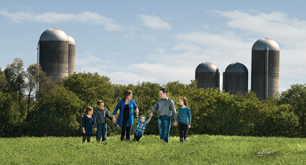
Composition is a very important part of the process. Choosing environments that have natural beauty is easy. The challenge is to create the relationship between the subjects and background such that there is a repetition of design and color, yet showcase the family. Also, the position of the subjects in the overall frame can emphasize the family while letting your eye move through the image and embrace the natural beauty.
A slightly different family grouping is shown in the image of the family photographed on the shore of the lake below. The tree stump was a natural to work with and allowed the opportunity of repeating the kids in the design of the stump and also a triangle. With most families, I often make two groupings…
the parents and then the kids. You don’t want to make that separation too much because it can visually separate the family. The heavy umbrella of branches and foliage (not visible in image) subtracted the natural overhead light on this heavy, overcast day.
The lighting was totally natural, taken at sunset, with the sun setting to the camera right. It is a sunny day with no clouds. In a situation like this, you have to wait till the sun is setting right on the horizon line so you can use direct sunlight. The beauty is that the light on the subjects is the same as the light on the background, so everything is in key.
A large family like this MUST be a horizontal group composition in order to keep everyone sharp. Note how your eye goes to the family yet drifts through the complete scene from foreground to background. A shallow depth of field (5.6 to 6.3) works if all the people are on the same plane and allows the background to be there but not intrusive.
Finally, consider “relationship images” such as the example below. They bring out a lot of emotion and are great sellers. The key is to insure that everyone is showcased and the image is not simply a “sardine” can of people jumping around on a couch. While candid or animated images are a wonderful contribution to a story or album about a family, they sometimes look too much like images that the clients can do on their own with the camera doing all the work. The young gals body language (arms) is a separate discussion. The parents felt it was “her” because that is what she did. It was natural.
Creating professional images that set you apart from other photographers is the underlying theme of the Texas School of Professional Photography. But it is more than just a school. It is a chance to embrace the experience of so many talented people and adding those skills and attitude to your everyday approach. By the end of the week, you will totally understand what it is to be PROUD of being a professional photographer.
