By
Eddie Tapp
Today, we have lost sight of a color managed workflow because it has become so easily installed into cameras, software, and other components. Paying close attention to calibration and color spaces has seemingly become a thing of the early days when digital took to the forefront. For those of you who have a color-managed workflow and are getting predictable results, the following is what you already have partially or fully-initiated. For the rest of us, let’s explore the exciting world of color management and see if there are any missing parts to your color control.
There are two conditions that are necessary for proper color management. One is what I call “centering,” which is zeroing or nulling or setting something to a neutral position. The other is “calibration.” Thus, once centered, you can then calibrate.
CONSISTENCY – The one thing that ensures predicable results is consistency. If you have a workflow that is consistent, then more than half the engagement is complete. Even if you’re getting bad results, and if they are consistent, you have the ability to troubleshoot the problem and 99% of the time it’s something very simple.

CENTERING – When you go to the controls on your monitor such as brightness, contrast, or even color, you would be taking it out of it’s centered position. There is nothing wrong with that if it works for you and, if you’re getting predictable results, all is well. Just know that you are also putting your monitor into a tilt of sorts unless you are using a calibration device. The same applies to cameras. There is nothing wrong with using a preset or matrix setup such as Picture Styles presets like Standard, Portrait, Landscape, Neutral, Faithful, and Monochrome, or even adjust your own matrix setup establishing custom contrast and saturation settings in camera. Using any of these setups will move your camera out of its native center, yet they become the center as long as you use them consistently. And frankly, using a Picture Style or custom matrix is actually centering your camera for a specific look and is recommended as your camera’s onboard processor will do a great job achieving certain looks that you want.
Using the camera’s default setting or, rather, not using any Picture Style setting will have your camera at it’s native and centered position, allowing you to create your look in post. This is closer to my personal workflow where I like to center (or use default) my devices and then use the controls and adjustments in Adobe Lightroom or Photoshop to create the look I want in post.
CALIBRATION vs PROFILING – In reality, calibration and profiling is a partnership rather than a competition, and people frequently confuse these terms. Calibrating is like giving a device a fine tune-up, while profiling is describing the exact color gamut of the device in it’s already tuned-up condition.

One key to color management in the physical sense is to center your device and calibrate using a setting to a known neutral state and then profiling if necessary using a device or software from the centered or neutral position. In other words, centering your device is simply calibrating and profiling that device in its centered state, enabling the best possible profiling.
CALIBRATION – What do you have that needs calibration? In reality, you have your camera, monitor, projector, scanner, and/or printer. Calibrate a digital camera by using a custom or preset white balance. Doing this will calibrate the camera to the lighting conditions and set a color temperature. Couple this with a good exposure and you have the basic calibration needed for consistency. The challenge comes from the many varied lighting conditions in which you might be shooting. You may need to recalibrate the camera for each lighting condition. When shooting consistently, if there is a series of images in the same environment such as a studio portrait session, and for some reason the color is off, you can make one correction and share the results with the rest of the images to maintain consistency.
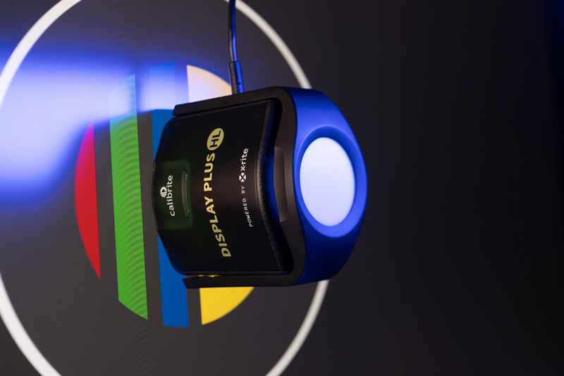
Monitor calibration is perhaps the single most important part of any color-managed workflow. No monitor comes out of the box properly-calibrated. There are a few that do come close if all you do is social media. But, when it come to using your lab or your own in-house printer, calibration is critical. When you calibrate there are only two primary targets, color temperature and gamma settings. Using a colorimeter to read color patches and contrast ratio (gamma) is the best way to get a properly-calibrated monitor. Prior to using a colorimeter, you must center or default the settings with the monitor controls; this will take your display off tilt and give you the best results your monitor has to offer. Just know various monitors have different contrast ratios and may appear different in the brightness or contrast after calibration, but colors should be close from one monitor to another.
For projector calibration, make sure to null (center or set to default) your settings on the project first. Now turn on your projector and give ample time for it to get full brightness, usually around 10-15 minutes. You can use the same colorimeter to calibrate the reflection on the screen. Simply review the recommended distance between the projected screen and the colorimeter. Actually, you’re not calibrating a projector at all, you’re calibrating the colors and gamma on your screen.
When you turn on a scanner, you can hear the scanner head moving across the bed (assuming it is a flatbed). The scanner is performing a basic calibration (i.e. white balancing). Most scanners are able to calibrate themselves reasonably well. Also, most scanners have LUTs (Look Up Tables) to use, allowing you to get specific looks while scanning.
If you use a lab for your printing, I can assure you that your printer calibrates their printers daily, whether ink jet or wet. Chemical (wet) printers need to be in neutral condition which depends on chemical mix or replenishment.
Ink jet printer calibration is a simple matter of keeping the print heads aligned and the nozzles cleaned.

PROFILING – The word ‘profile’ is used in a variety of nomenclatures, not to mention silhouettes, portraits, personal data, portrayal, characterization, camera settings, Profile Browsers, ICC, ICM, and more. With that in mind, let’s look at creating profiles for a color-managed workflow.
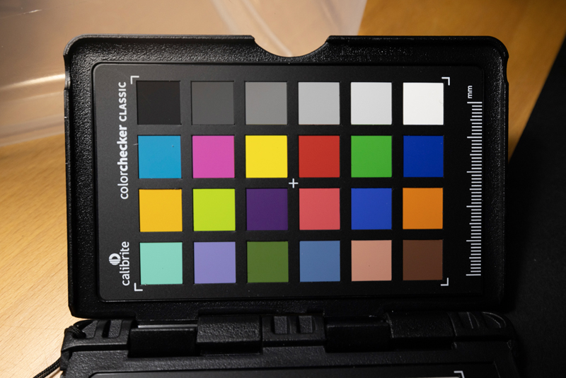
Camera profiles are created using a known color patch chart such as the Calibrite’s 24-patch Colorchecker Passport. Photographing this chart with proper exposure and even lighting will allow you to create an optimized characterization of your camera’s sensor. This can improve skin tones and enhance certain colors from your camera’s sensor.
When you calibrate your monitor as described above, once you have read the color patches with a colorimeter and save the results, the profile is automatically created and saved for you as an ICC (or ICM) profile that will automatically be saved into your computer system’s folder, ColorSync on Mac, and the Color folder in the Windows system. The same goes for projectors.
Because of the limitations of scanner software, you cannot create profiles for all scanners. Some scanning software does not have advanced color management options. I find most current scanners do a pretty darn good job these day of providing a nice scan. If you are not getting the best results from your scanner, you can scan charts such as Kodak IT8 target and create the scanner profile using third party software.
If you are printing on an in-house printer such as inkjet, dye sublimation, thermal or even wet you would need a custom ICC or ICM profile of your printer to get predictable results. Profiles for various papers are available online from the manufacture’s website. Profiles are also downloaded automatically into your system when you initially install the drivers for your new printer, such as with Canon, which automatically loads a host of printer ICC Profiles into your system. These are what I call “canned” profiles because they are generic in use, meaning they don’t consider your printing environment such as altitude, atmosphere, humidity, and temperature which all effect how printers yield to ICC Profiles.
You can also hire a professional color management consultant to create custom profiles, or you can purchase the software and hardware to create them yourself. This involves printing a series of patches (I use more than 2000 patches in my profiles) with NO COLOR ADJUSTMENT or any color interference; the file that you print with patches must not have a color space embedded, and once the patches are printed you use a color spectrophotometer to read the patches that create the custom ICC Profiles. And, yes, it’s that simple.
COLOR SPACE – This brings us to the all-important management of color spaces. It’s really very simple yet there are a host of different analogies of what color space to use, when and where, and what is best for a specific workflow. The best use of color space is the one that works for you.


What is a color space and how to use it? A color space is a known gamut of color and tone that your file resides in, kind of like its home. A RAW file does not have a color space home until you’ve removed it from its origin, such as convert to a TIFF or JPEG. Even if you have set up AdobeRGB or sRGB in your camera, that is only for JPEGs and is not embedded in your RAW file. In our world, ProPhotoRGB is the largest color space profile you can work in, AdobeRGB is a smaller but smart color space to work in, and sRGB is the smallest. When outputting your file, sRGB is the only color space when you are sending a file to anyone else, a lab or especially social media. Some professional labs allow other color spaces, so check first.
My recommended color space workflow is working completely in ProPhotoRGB, the largest color gamut and tonal values. There is so much more during the process, especially between delicate tonal values transferring from highlights to shadows, and is known to eliminate banding in blue skies on properly exposed images. Once the process is complete and ready to send to a lab or client, the color space is then converted to sRGB.
What’s awesome about Adobe Lightroom is when you import your RAW files you’re working in an expanded space of color and bit depth by default. If you export to Photoshop and look at your color space, it is in ProPhotoRGB. This is a default in Lightroom unless you change it in the Preferences and External Editing. When you command or control-S to save your work back to Lightroom, it saves as a 16-bit ProPhotoRGB TIFF, allowing you continue to work in a huge color space and tonal values. When you export your images by choosing JPEG, sRGB is the default option to use and this locks in all the work you’ve just created. So, always use the sRGB option, and this will allow predictable results, especially from labs and social media.
SETTINGS – When it comes to color settings in Adobe Lightroom, you don’t have to do anything. By default, you’re working in the wide world of color and tone, and when you export, be sure to choose the option sRGB in File Settings (which is also default).

If you use Adobe Photoshop then there are two places you can establish. One is in Adobe Camera Raw. At the bottom of the screen, click on the color space bar; sometimes it might say sRGB as this brings up the color options that will embed your raw file when you select “open” and choose the color space home you want to work in and bit-depth. When you open the file, if a message comes up and asks you what to do, always choose “Use the embedded profile” (instead of the working space), if that shows up unless you have specific need to choose the other options. You can also establish your color space settings for your working space in Photoshop under >Edit >Color Settings.

THREE STAGES – The stages of any photographic workflow are: Input, Process, and Output. These are the stages when managing color is important to obtain predictable results. Color Matching is a science in itself and getting exact results funneling pixel data through a series of processes, devices, and profiles is rarely Delta E zero. Obtaining predictable results is our target, which creates successful Color Managed Workflows, and the key to achieving that is consistency.
Using tools like colorimeters for monitor calibration yields Delta E values (where a value of 0 indicates perfect color, 1 to 2.5 is visually-acceptable and can significantly improve your color management, and 100 btw is a mishap). Note that some monitors age and diminish their luminance and/or chroma data and are no longer usable for color matching.

the principles remains essential.
MY PRINTS ARE TOO DARK! – Having a healthy histogram is paramount in obtaining predictable results from your lab. A well-balanced histogram is crucial for accurate color reproduction in printing. Remember you have low key, average, and high key images, and your histogram should reflect those in a healthy display of information without blocking the shadow or blown out highlight regions.
Hopefully you have found a nugget in my article that is helpful. As far as color management, nothing has changed since color management became a thing in the mid ‘90s. Since the early 2000s most manufacturers and software developers have adapted color management into their products.
Today, color management is largely automated, but understanding the principles remains essential. Calibrate your monitor to avoid discrepancies in printing, and always use an appropriate color space home for your files.
Remember: Calibrate your monitor, otherwise you may be looking at erroneous color and tone and wondering why your prints look so off. Then, adapt by knowing the color space home your file is in and make sure if you send it out in sRGB.
Back at the turn of the century, I was honored to be asked to join UPDIG (Universal Photography Digital Imaging Group) as the representative for the Professional Photographers of America. This international group of professionals is dedicated to bringing CM into the world of manufacturers and photographers, understanding the different protocols in different countries as well as the importance of calibration and proper use of color spaces. The UPDIG website is still available and saved by one of the pioneers for posterity.
Keep your workflow easy on your eyes by centering, calibration, and consistency.