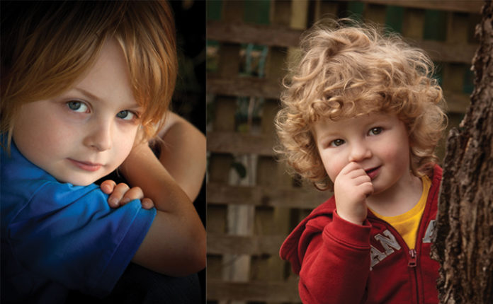
Think like a customer… when you see a photo you are in, what do you do? You look at yourself. You analyze what you look like. That is simply human nature. That is also what our clients do. So, what is the message here?
It is EXPRESSION. We can go to great lengths to plan composition, lighting and all manner of things but purchasing desire always comes down to expression and the emotion that evokes. Ultimately it is what the client is paying for.
The most successful photographers in our industry understand this. They do not just “take pictures or spray and pray”. They actually analyze their subjects and explore the views of their faces and what kind of expression is the most flattering. They also consider what kind of expression conveys the purpose of the portrait. Exploring expressions that are not default smiles opens an amazing opportunity of actually connecting with the subject and conveying their personality.
To support this approach, look back at the famous portraits done by Karsh. Photographers around the world look at those images with respect for the story conveyed, the posing and lighting. As you study his images, you do not see big default grins. Can you imagine the image of Churchill with a big toothy grin. It simply would not convey the “bulldog” of the English parliament during WW11.
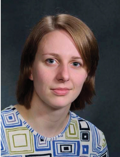 Facial Views: This is the classic and MOST common approach. When we look at a face, we need to look at the shape of the face in soft expressions and full smiles. As we look at this lady, we see a very attractive woman. When we look more closely (with a professional eye), we see the eyes are different sizes, the cheek and jawline are not symmetrical and her gentle smile is diagonal. We must explore the other views of the face to define her best attributes and view of the face. In a case where one eye is larger than the other, one solution is to turn the head where the larger eye is further away from the camera.

Profile Left and Right: Commonly, profiles are the most dramatic in low key situations. Is a profile the most flattering view for most? It can be but one has to look closely at the shape of the face (nose, cheeks, forehead and flow of the hair) to see if it works. Not everyone has a flattering profile, but when photographing a profile image, it is always best to use short lighting.
Two-Thirds View: Now let’s look at a two thirds view (turning the head to the left or right and often called a three quarters view). This view, as seen on the following page, is used in every session as it tends to create an oval perception of the clients face.
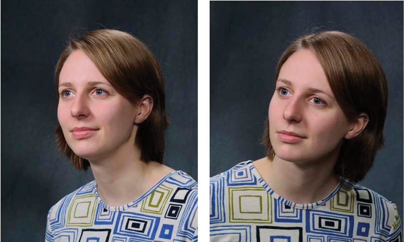
Note the differences in the two images above. The image on the right has a foundation for the head to rest on. The image on the left conveys a bobble head on unbalanced shoulders. This kind of detail is important. A key concept to consider is the direction of light as it relates to the flow of the hair. Too often, when there is a clear sense of the “flow” of the hair, photographers bring the main light in from the opposing direction. You often see conflicting shadows being cast by the hair and a visual “conflict” with the direction of the main light and the hair. Now lets take this one step further. In the above image (right), the face has a beautiful oval look. HER right eye is still a little bigger but very flattering.
The following (right) is what we see in many images today… turning the head too far and losing the beautiful oval and the connection with the viewer. This distorts the beauty of the face and you end up photographing a “cheek” rather than the beauty of the person.
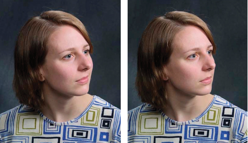 As we turn the head, this young women loses the elegant oval to her face seen in the proper two thirds views.
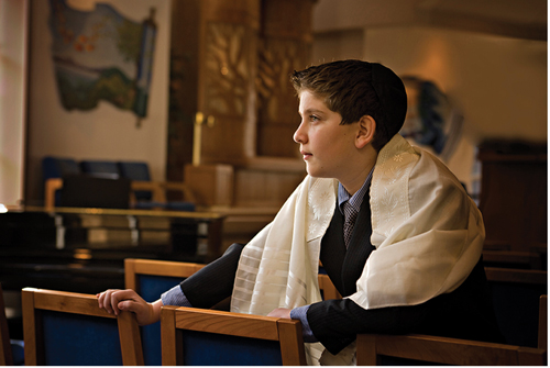
Eye Direction: Another consideration is eye direction (below). In the above situations, we see the eyes pointing in the same direction as the nose. In fashion photography you often see the eyes drifting away from the camera point of view. This is done on purpose as fashion photographers want you to pay attention to the clothes and hair (not fall in love with the model).
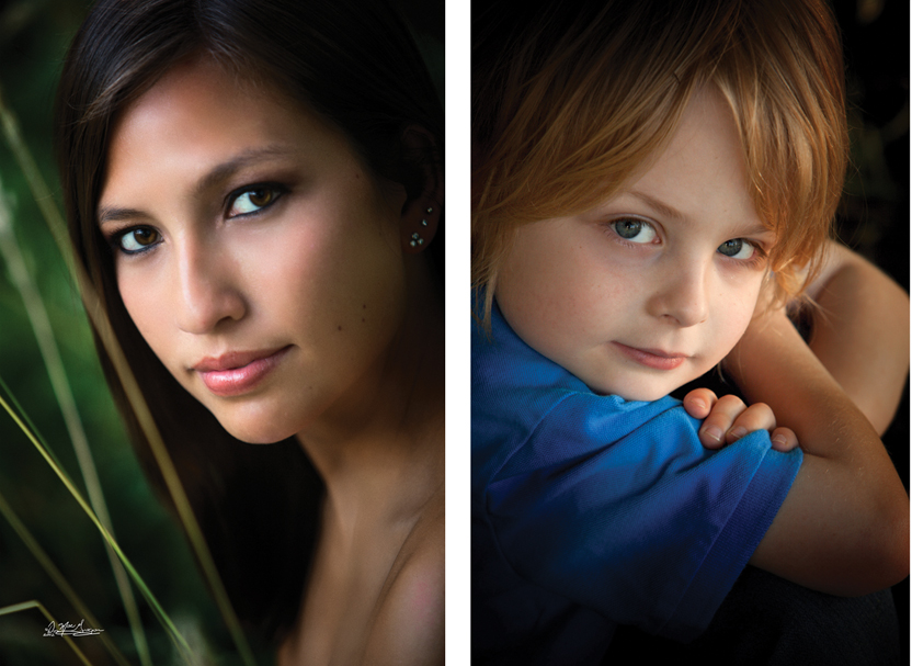 In portrait photography, we want to make a connection with the subject which means we must make a connection with the eyes. The only time we should break this rule of the eyes pointing in the same direction as the nose is if you bring the eyes back to the camera or you want to show an emotion of disinterest (lacking engagement with the viewer). In a situation like that you have to have a purpose. If there is no connection with the person, you get a different message. That is rare in portrait photography.
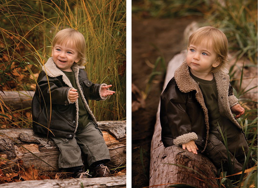
Gentle Expressions: Look closely at these two images (upper right). Both are good and potential sellers. The smile will be embraced by mom and grandma but look closely at the gentle smile in the right pose. It is timeless and you see the innocence of a child.
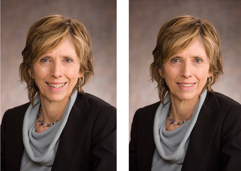 A serious professional also understands the subtle difference in expressions and takes the time to share his / her perception to the client. Consider these images (above). They are simple business portraits yet one is head and shoulders better than the other. Physically there is very little difference. Clearly the right image is the more flattering portrait… the face, mouth and eyes are relaxed yet she is smiling.
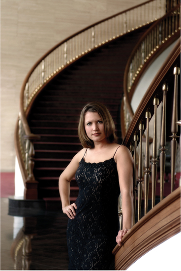 Expressions that are gentle and often “non-toothy” tend to stand the test of time and also convey more personality and “soul.”
I am NOT suggesting to avoid smiles. I am encouraging exploring non toothy grins for your resource of image captures. A key to successfully selling this approach is to make the client aware of what you are doing and why. You do not want the objection of “he isn’t smiling” to overshadow the impact of gentler expressions. Always handle objections BEFORE the client brings them up.
It may seem daunting to explore facial views and expressions during a session but in reality it really is not difficult if you have taken the time in advance to manage your posing and lighting issues. Once that is done, you simply talk to the client and keep a careful eye on their expressions. Then the KEY… as the artist, make a decision of what look is the best and convey your enthusiasm to the client.
 Don MacGregor is from Vancouver, BC, and taught a class on “Lifestyle Environmental Portraiture” at Texas School ‘18. His class covered composition and posing for individuals and groups, environmental light control, designing portraits for wall decor, sales, and much more. To learn more about Don MacGregor and his work, go to www.MacGregorStudios.com.


