A McDonald’s Burger Shoot
by Dave Montizambert
In a land far away… a long, long, long time ago… and I’m not going to say how long ago, but it was in the last century, my brother/partner Mark and I landed a big client through an ad agency. That client was the king of fast food, McDonald’s. We won them over with our dramatic lighting style and started creating images for their local and national advertising campaigns. Interestingly enough, as much as they loved our look, the art director directed the scanner operator at the service bureau (or color separation house as they were called then) to open up the shadows of our film transparencies (4×5 / 5×4 inch positives). In other words, he wanted to make our carefully crafted “lighting drama” a little flatter!
Since printed work has a greatly reduced Range of Contrast compared to film or digital, we had carefully created our rich dark shadows to reproduce on press with all essential detail! A considerable amount of painstaking light metering with both incident and reflective meters was done to guarantee stunning printing results. So what gives?! It wasn’t like we were creating our lighting willy-nilly. I guess they knew the aesthetic of their audience better than I, or they were playing it safe. At any rate, I’ll drop that rant now. Besides, the work was really fun and challenging and paid really well.
Still, I don’t get it. It’s like two goldsmith jewelers I know who create beautiful hand-made, one-of-kind Baroque jewelry that garners so much attention from people browsing their shop. More often than not, the clients they land will say, “I love your work, but could you make something for me that is more normal-looking?” Subtext: “I love your work and I want you to craft a piece for me, but could you please make it boring?” It’s not uncommon in the arts, but as my mentor Dean Collins said, “Beauty is in the eye of the checkbook holder!”
Pre-production for these shoots was very involved. By law, since the food subject was the product to be sold, the image had to be made with actual ingredients from McDonald’s. So, there could be no substituting of ingredients that would photograph better. All the product (buns, sauce, meat patties, etc.) would arrive in the morning on the day before the shoot. We had a visit later that morning from the art director, the agency account executive, plus two or three marketing people from McDonald’s, our food stylist, and assistant. All were there at my studio to see the ingredients and further discuss the image to be created. Let the casting session begin!
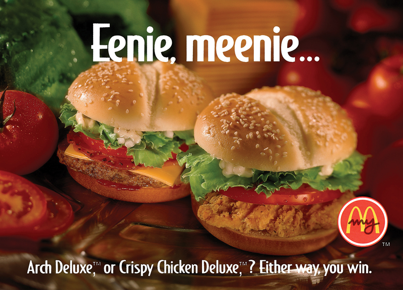
We went to great lengths to find the best ingredient candidates and were sent much more than two or three of any given ingredient. The craziest was the buns. All 200 of the buns sent to us were laid out on a long table for the mob to cast from. We would discuss the attributes of each bun, such as shape, color consistency, and placement of sesame seeds on bun tops.
After cutting out half a dozen hero buns from the “bun herd,” the food stylist would add and subtract seeds for a better look. Then it was on to the meat patties. These were submerged into a deep pan of oil to soak over night to make them really plump up. On the day of the shoot, our food stylist would make further modifications to the hero buns by partially hollowing out the bun tops and replacing the space with bunched up pieces of paper towel to make the buns less flat looking. As rigid as the rules were, it was okay to enhance reality as long as it was the actual client ingredients. Ah, truth in advertising! Sometimes, when people at parties asked me what I did for a living I would say, “I freelanced for the Department of Lies!”
On the day of the shoot, the food stylist would quickly throw together stand-in hamburgers for us to create and fine-tune composition and lighting. As the composition of subjects and lighting took place, there was much talk between myself, the agency, and the McDonald’s people on the above. Sometimes the McDonald’s representative would have to contact head office back east to confirm certain things like lettuce… “Is this the correct lettuce for this new burger?” That could take up to an hour or more since the head office time-zone was three hours ahead of us and more often than not the decision makers would be out to lunch, literally.
It all seems kind of crazy. But, in essence, we were shooting the “prototype” for a new, yet-to-be released product so there would be many last-minute changes and decisions made. As boring as it was to put the shoot on hold for an hour or more, we were billing full rate for everyone for the extra time. McDonald’s was really good about this.
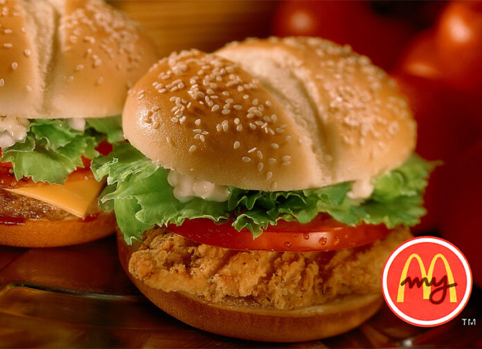
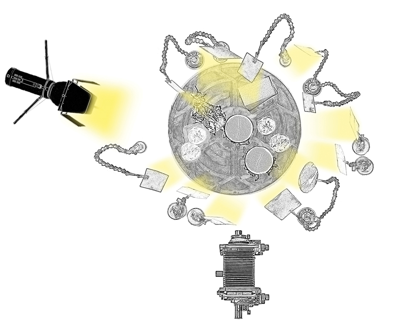
The title image is a good example of the kind of images we created for McDonalds. The lighting for this image (see diagram) was pretty much the lighting we did for all the McDonald’s shoots. Usually, one studio strobe was placed behind and a bit to the right or left to backlight the subjects. Many small silver-card reflectors of varying size and shape were placed in front, behind, and to the side of the subjects. These cards caught light spilling over top the subjects from the backlight and strategically redirected it onto them.
The idea was to selectively light key areas and then use a fill reflector (a rectangle of white foam-board from above set) to bring up the shadow areas. Where the fill did not provide enough shadow detail due to the actual tone being a dark pigment, more silver cards were positioned, usually from the side to sweep across the area bringing out texture rather than fully lighting the tone. With this card in place, the shadow area would remain dark but with subtle texture running through it.
Once the lighting was set, we would mark the position of the stand-in burgers with small blocks of wood and then remove the stand-ins. Next, the food stylist would bring the hero burgers onto the set and we would painstakingly place them using the blocks. Once in place and the positioning blocks removed, a little fine tuning of reflector cards was usually necessary. Then the food stylist would finesse the burgers, often adding last minute mayonnaise and/or sauce and/or ketchup with a syringe that would slowly run down the meat and/or lettuce making the burger look mouth-watering tasty!
Even though these shoots were often one light setups, they were quite complex. The tabletop set was an absolute forest of light stands, boom arms, magic arms with silver cards, and gobos! Once again, look to my simplified lighting diagram of the two burger setup. We used a lot of sandbags to mitigate unwanted lighting changes due to bumping and tripping, but even with that precaution taken, our top-tier food stylist seemed only able to see his work and not the whole set and would charge into the lighting forest to tweak a piece of lettuce, often knocking a silver card or two out of place. Ahhhhh!
The lighting we used for McDonald’s was a dramatic cinematic style. With such small subjects, regular studio strobe lights with optical spots or grids would not be small enough. There are tiny optical spotlights available, but they are really expensive. On some of our food shoots we might require up to 30 of these. This is where the silver card reflectors came in. For under $20 (Canadian) we could purchase a big sheet of silver board then cut out the actual shape and size we needed to do the job. So, even though this was a big high-end client, we didn’t need to break the bank to get the job done!
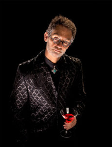 Dave Montizambert lectures internationally on lighting, digital photography, and Adobe Photoshop. He is also a published author having written two books on lighting and digital photography plus numerous magazine articles on these topics in North America, Europe, Russia, and Asia. Dave produces “DaveOnDemand” lighting tutorial-based photo training and also creates lighting & Photoshop tutorial DVDs for www.software-cinema.com and www.PhotoshopCAFE.com/video. Dave is available for lectures and workshops in your area and can be reached at:
www.montizambert.com.


