


The Cognitive Impact of Color vs. B/W
by
Kelly Schneider
In photography’s early days, every image was monochromatic. The world was captured in shades of gray. Even as technology evolved to bring us color film, black-and-white imagery has retained a unique allure. This enduring appeal hints at fundamental cognitive and emotional differences in how humans perceive and respond to color versus black-and-white images. In reality, some scenes seem more powerful without color.
The presence or absence of color affects our attention, emotions, and memory of images. Let’s explore these questions by examining psychological and neuroscientific research on color and monochrome perception, analyze how the absence of color can enhance an image’s impact, and consider historical and practical perspectives. We will also highlight case studies of renowned photographers known for their black-and-white work – from Tim Walden’s “Relationship Portraits” and Ansel Adams’s majestic landscapes to Sebastião Salgado’s soulful documentations – and discuss techniques for creating compelling monochromatic photographs. Throughout, we will see that color and B&W images engage the human mind in distinct ways, each with its own artistic and emotional strengths.
Photography is a language of light and shadow. While color captures the vibrant realism of life, black-and-white photography speaks in tone, shape, and nuance. Understanding how viewers perceive and respond differently to color and monochrome images reveals why each has unique emotional and psychological power. So, let’s explore the neuroscience, psychology, history, and artistry behind these two visual modes, guiding photographers in choosing the most impactful way to tell their stories.
The Brain on Color vs. Monochrome – Our visual system processes color and luminance separately. Cone cells register color; rod cells perceive light and dark. When viewing black-and-white images, the brain often fills in missing hues from memory, suggesting top-down processing is at play. Neuroscientific studies show areas like V4 activate even when viewing grayscale images of familiar colored objects.
In addition to V4, the brain processes luminance (light and dark information) primarily in early visual areas such as V1, V2, and V3. These regions are sensitive to contrast, shape, and spatial detail. Unlike V4, which specializes in color, V1 – V3 are crucial for interpreting the structural and textural elements that become the core expressive tools in black-and-white photography.
Color images tend to be more memorable, provided colors are natural to the scene. When colors are incongruent or artificial, memory benefits disappear. Thus, color enhances recognition and retention, especially when aligned with prior knowledge.
Color also amplifies emotion. Studies confirm that color boosts viewers’ emotional responses: joy feels more intense in color, and sadness more poignant. However, it can also distract. Bright hues can steal focus from the subject or shift attention unpredictably. Black-and-white, by removing this chromatic noise, focuses the viewer’s attention on form, texture, and contrast. It encourages longer looking and deeper contemplation. Emotionally, black-and-white often evokes timelessness, seriousness, and introspection, bypassing visual clutter and distilling moments to their emotional essence.
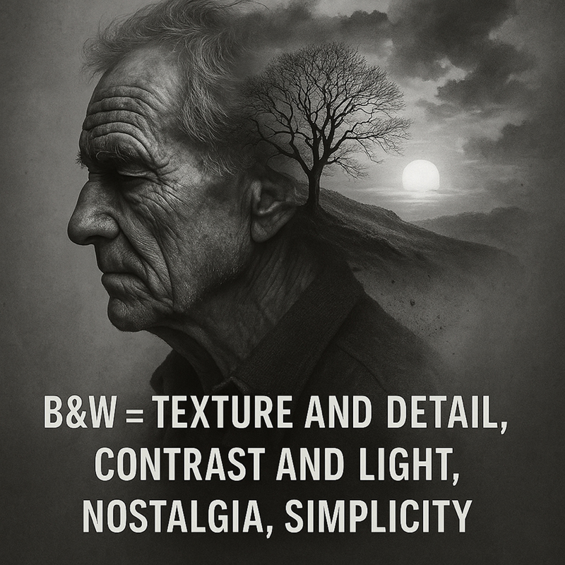
Why Black-and-White Still Matters – B&W = Texture and Detail, Contrast and Light, Nostalgia, Simplicity. Without color, other elements rise in importance:
• Texture & Detail: Skin lines, fabric weaves, and nature’s raw edges emerge more vividly.
• Contrast & Light: The play of shadow and brightness becomes central to storytelling.
• Mood & Tone: B&W images often evoke a sense of nostalgia or emotional gravitas.
• Simplicity: B&W eliminates distractions, allowing subject and message to take center stage.

Though color often creates stronger first impressions, monochrome images tend to resonate longer, embedding themselves in memory through narrative clarity and tonal richness.
Early images like Niépce’s heliographs and Daguerreotypes captured life without color. Even as color film emerged in the 1930s, many artists resisted the switch, valuing black-and-white for its control, tonal subtlety, and perceived seriousness. Photographers like Ansel Adams, who created the Zone System, demonstrated the expressive potential of black-and-white landscapes. Others, like Sebastião Salgado, have used monochrome to convey humanitarian stories with stark emotional clarity.

Today, black-and-white remains a powerful creative choice… a means of abstraction and focus in an era oversaturated with color imagery. Several notable artists, along with their insights, include:
PPA’s Tim Walden, known for his “Relationship Portraits,” uses black-and-white to emphasize emotional connection and character. His refined lighting and posing technique strip away distractions, revealing the depth of family bonds and individual presence.
Ansel Adams used B&W to express nature’s grandeur with full tonal control.
Sebastião Salgado believes color distracts from emotional truth. His monochrome images are haunting and universal.
Daido Moriyama uses high-contrast B&W to explore the raw energy and alienation of urban life, translating mood over realism.

Here are some practical techniques for monochrome impact:
• See in Light: Pre-visualize scenes in contrast, not color. Look for shadows and highlights.
• Leverage Texture: Choose subjects with strong surface qualities.
• Simplify Composition: Remove distractions; use bold shapes and negative space.
• Control Tonal Range: Balance deep blacks, bright highlights, and midtones.
• Use Filters: Emulate traditional colored filters digitally to enhance sky, skin, or foliage contrast.
• Edit for Intent: Decide if your story needs color. If not, use monochrome to focus emotion.
Human vision and cognition respond to color and black-and-white images in profoundly different ways. Color images engage our senses immediately. They trigger hard-wired attentional responses, amplify emotional reactions, and tend to lodge quickly in memory. They show us the world in all its vividness, evoking moods through hues and making scenes feel lifelike and relatable.
Black-and-white images, by contrast, speak in a subtler visual language – one that the brain treats more as an interpretation of reality than a copy. In monochrome, we rely on luminance cues and often activate higher-level cognitive processes, filling in colors from memory, focusing on shapes and forms, and extracting meaning from light and shadow. With color “removed,” our eyes attend to composition, contrast, texture, and the emotional expressions of subjects. This can make black-and-white images feel more intimate or profound in certain contexts, as if they distill the essence of a scene. Psychologically, color tends to state the message up-front, while black-and-white suggests and invites reflection. Neither is inherently superior. They are different tools for different storytelling purposes.
Photography as an art and practice has been enriched by this duality. Historically, it moved from the silver-toned solidity of early photographs to the chromatic explosion of modern digital images. Yet, as we saw with masters like Tim Walden, Adams, Salgado, Moriyama, and many others show us that some of the most impactful photographs in history are monochrome – precisely because black-and-white can transcend the literal and tap into the symbolic or emotional realm.
Even today, in a world “saturated with colors,” photographers like Pete Rezac turn to B&W to “elevate [their] artistic vision,” emphasizing light, composition, and shadow to create images that stand apart.
On the other hand, color photography has achieved its own artistry, often by understanding when color should take the lead (to convey atmosphere or vibrancy) and when it should not. The best modern photographers are fluent in both “languages,” choosing color or monochrome deliberately to shape viewer experience.
 Kelly and Kalina Schneider are a husband-and-wife team with a passion for creating unique portraits and sharing their expertise. They bring a potent blend of Kelly’s advanced technical skills of 30+ years teaching complex skills in the Department of Defense and Kalina’s artistic vision, which includes a Master’s degree in art from Poland and more than 10 years at the National Gallery of Art. Learn more about them at: ksfinearts.com.


")


