by Dave Montizambert
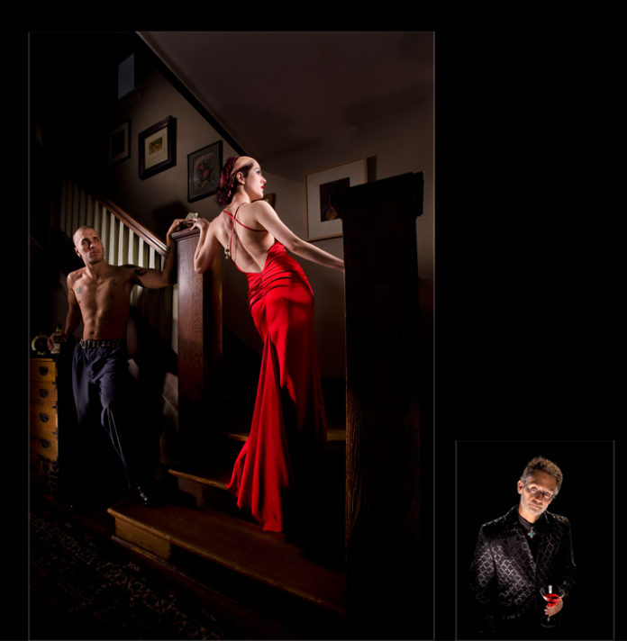
Not only does this photographic exposé entitled “Stairway to Sin,” of well-heeled model Renée Robyn and not so well-heeled Tyler Baker, tread on some toes with its suggestive nature, it also steps on the photographic toes of traditional lighting and its “rules.”
In fact it steps so far away from traditional lighting that there isn’t even a fill light. It is selectively lit with five lights, each light emphasizing to a lesser or greater degree, an area of the scene. What? No fill? Will I burn in hell as a result? Will I be excommunicated by the photographic community and hung, drawn, and quartered at the next convention for breaking the rules?
In principle I am opposed to rules, especially in photographic lighting. In my mind, rules are the tools of people trying to manipulate others, not always for the bad but usually at the expense of thinking and free will. At any rate, photographers are always talking in hushed tones about “breaking the rules” as if these photographic rules are somehow sacred. I suppose using the term “rule” is harmless enough, but I believe that the words we use reflect and shape our base philosophies. It seems to me that a rule suggests something that must be followed and breaking it is at your own peril.
I’m not suggesting chaos here. This rant of mine is really about semantics. I think we need guidelines to live by and by which to create lighting, so it would please me to no end if we turned our lighting rules into guidelines and consider them as starting points rather than fixed “Don’t mess with me” entities. Enough philosophizing. Now, on with my “rule busting” shoot.
The setup: Our Madame of the staircase Renée, clad in a dazzling “it’s-so-red-it-hurts” cocktail gown, is seen pausing on the stairs in what seems to be a discreet transaction with drunken sailor, Tyler. The scene takes place long ago in a bordello at night, so the look is dark and dramatic. To help create this dramatic feel, a full frame sensor DSLR, paired with 17 mm lens, was positioned low on a 3 foot tripod, some 6 feet away from Renée. This low angle and the distortion created by shooting so close to the subjects, offers much dramatic affect.

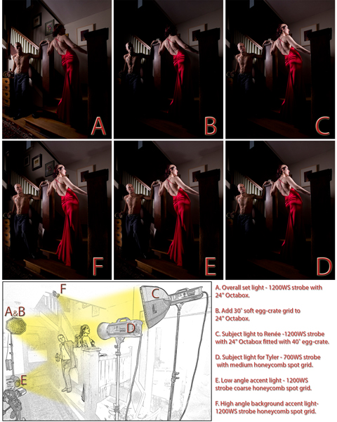
In this image, like all my images, I use light to separate the subjects from their surroundings. An overall set light was placed to camera left side of the photo-set some 9 feet away from Renée and sat 7 feet above the floor. This 1200 watt-second studio strobe was fitted with a 24 inch Octabox which had a 30 inch soft egg-crate affixed to its front. The soft egg-crate grid narrows the beam of light emphasizing the subjects and not the background. The power of this light, measured with an incident meter placed against Renée and with its dome pointed back at the Octabox, was adjusted to underexpose the area by 1 stop. To see the effect of this light and to see the effect on the image with and without the soft egg-crate, compare images A and B. Also, note the positioning of this light labelled A&B in the lighting diagram portion.
Suffice it to say, Renée is the main attraction in this image. She is further drawn out from her surroundings by the placement of a second 1200 watt-second strobe. This light acts as a main light to her and was placed some 6 feet from Renée on the camera-right side of the photo-set and was raised to sit 8 feet above the floor. It was fitted with an another 24 inch Octabox and sports a 40 inch soft egg-crate. The power of this light, measured with an incident meter placed against Renée’s face and with its dome pointed at the Octabox, was adjusted to correctly expose her flesh. While this soft egg-crate focuses most of the light on Renée, it does allow some to spill past onto Tyler, partially illuminating his face. Compare images B and C. Also note the positioning of the light labelled C in the lighting diagram portion.
The fact that Tyler’s face appears underexposed in version C helped to make him secondary to Renée. But he appeared just a little too dark for my liking and so I decided to brighten him up using a 700 watt-second strobe fitted with a medium honeycomb grid placed some 9 feet from him on the camera-right side of the photo-set and raised up to sit 7 feet above the floor. The power of this light, measured with an incident meter placed against Tyler’s face and with its dome pointed at the strobe, was adjusted to set the accumulation of both this light and the previous light for a 1 stop underexposure at his face. Compare images C and D and note the positioning of this light labelled D in the lighting diagram portion.
Just like Tyler’s face, the lower portion of the scene also needs more light and so a third 1200 watt-second strobe fitted with a coarse honeycomb grid was placed some 9 feet from Renée on the camera-left side of the photo-set and was supported with a floor stand some 8 inches above the floor. The power of this light, measured with an incident meter placed against the bottom of Renée’s gown and with its dome pointed at the light, was adjusted to underexpose the area by approximately 1 stop. Compare images D and E and note the positioning of this light labelled E in the lighting diagram portion.
Finally, to bring up the background exposure a little in the upper portion of the image frame, a fourth 1200 watt-second strobe fitted with a coarse honeycomb grid is placed just out of frame at the top of the staircase on the camera-left side of the set. This light was approximately 12 feet from background area that it was lighting. The power of this light, measured with an incident meter placed against the background wall and with its dome pointed at this fifth light, was adjusted to underexpose the area by approximately 3 stops. Compare images E and F and note the positioning of this light labelled F in the lighting diagram portion.
As you can see by the preceding description of this image, the lighting doesn’t follow standard portrait methods. I should point out that it was not created in this way for the sake of “breaking the rules.” Instead, it was created with a particular dramatic look in mind that standard portrait lighting wouldn’t achieve. I would also like to point out that photographic rules are not unbreakable laws. In photography, the only laws you cannot break are the laws of physics, unless of course you own Photoshop. So, to wrap-up my rules-rant, I would like to finish with this: I think we should keep photography democratic rather than autocratic… creative rather than restrictive.
 Dave Montizambert lectures internationally on lighting, digital photography, and Adobe Photoshop. He is also a published author having written two books on lighting and digital photography (www.montizambert.com) plus numerous magazine articles on these topics in North America, Europe, Russia and Asia. Dave also creates Photoshop tutorial DVDs for www.software-cinema.com. Dave is available for lectures and workshops in your area and can be reached through www.montizambert.com.


