Using Specular Highlights to Create Shape & Form
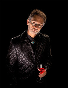
by Dave Montizambert
Texas School Instructor
Many of my lectures, workshops, videos, and articles revolve around lighting people, and yet so much of my career in advertising was spent lighting things like food, liquor and spirits, jewelry, automobiles, and surprisingly enough, billiard balls. In fact, I initially did many exercises lighting billiard balls to apply the theory of light that I was learning from my mentor Dean Collins back in the mid 80’s. These little critters can be tough things to light, especially for a novice, but I persisted and learned a lot in a short time. All this to say, for this article it might be a nice change to look at lighting something other than people, so I thought, how about billiard balls?
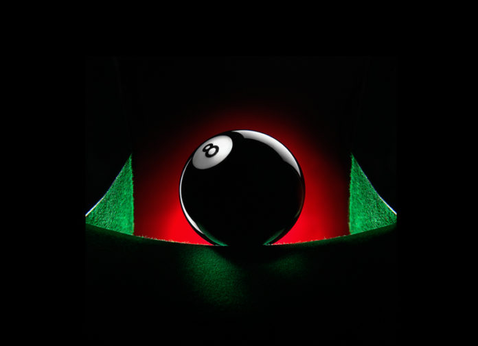
This black billiard ball image, entitled “On Edge” (see image above) was one of 2 dozen different images I designed and shot back in the early 1990s for an advertising promotion directed at art directors (ADs) and graphic designers which was to be distributed over all of North America. Its purpose was to sell advertising space in two related Vancouver newspapers, the Vancouver Sun and the Vancouver Province. The two newspapers were owned by the same media company Pacific Press – the Sun targeted the white collar reader and the Province targeted the blue collar reader. The final piece was a quality printed workbook adorned with billiard centric images for AD’s and designers to keep track of their projects.

Back in the early ‘90s, billiards was the “new” cool thing to do – “slumming it at the pool hall if you will.” This promotion centered around the tag-line, “The One Two Winning Combo,” which is a billiards’ maneuver involving the cue ball striking the yellow one-ball which in turn strikes the blue two-ball (see image right) then does something else I don’t remember (it was a long time ago you know). The fact that yellow was the Vancouver Sun’s corporate color and blue the Vancouver Province’s corporate color, was a nice tie-in with the yellow and blue balls. Graphic designer Timm Williams, the creative mind behind aligning the newspaper’s image with “billiard-cool” was well aware that his target audience was mostly young hip ADs and designers who were already preconditioned to iconic merchandizing having toted Star Wars™ or Barbie™ adorned lunch-kits to school not too many years beforehand. So he figured that a billiard adorned creative scheduling/workbook would be a shoo-in, or so was the gamble. The connection between billiards and the newspapers was: if a creative bought advertising space for their client in either of the papers, they would also get the same in the other paper, they would gain a winning One Two combo advantage. How successful it was I don’t know but since it was being used far and wide I got to charge lots and lots of money, and Timm gave me lots and lots of creative freedom to create 24 fun-filled billiard images. This self important looking 8 ball you see before you was one of these 24 and being round, black, and shiny was one of the more challenging balls to light. When tackling a complex lighting situation I start by thinking contrast – how am I going to show this black shiny ball in a dark dramatic way?
Here’s my thought process: If you wanted to light something black and shiny like my ominous 8 ball, how would you do it? Most would say, “With highlights,” or more accurately Specular Highlights. But why not shadows? Can a shadow exist on something that is black? Would there be any contrast? Look again at the eight ball image. Where is the shadow on its black surface? We perceive the ball to be black because it is absorbing almost all the light striking it and returning almost none of it. In theory black is the absence of all light. A shadow is an under-exposed area, but black under-exposed still appears as black. In other words, you cannot make true black look any darker than it already is. Visually, a shadow
cannot exist on pure black. Now if that tone were dark gray rather than black, it would be possible to produce a shadow on it. However, there would be little room tone-wise to create noticeable contrast so it makes sense that Specular Highlights are better suited for creating shape and form on dark to mid toned subjects and that shadow is better suited for mid to light toned subjects.
Lighting really comes down to contrast, if something is black, making part of it darker to show its form just won’t make a visible difference – no contrast, no shape, no glory!
The lighting of this image was really critical because it had to be made right, right in-camera – that camera was loaded with medium format transparency film. This was early days for digital where digital cameras, instant previews, and Photoshop were still pretty weak so not a viable option. Lighting and the creation of images was still all math, meters, and magic (visualization). On the subject of lighting, it is interesting to note that the bottom portion of the ball, which was out of the light from my studio strobe lights, received less light than the lit upper portions of that same ball. The lower ball areas read 6 to 8 stops (reflective 1˚ spot light-meter reading) below the camera setting making them photograph as pure black. Yet the lit black areas next to the specular highlights look just as black. This is because they read 4 1/3 stops (again a reflective 1˚ spot light-meter reading), below the camera setting. Any tone that reads reflective 4 1/3 stops below the camera exposure setting will image as pure black on Kodak Ektachrome transparency film and somewhere around 5 stops below for digital captures depending on processing. Bottom line is, you can’t get any blacker than black!
And finally, being the early days of digital post production, the black ball image was used without any retouching hence the need to make it as perfect as possible in-camera. A short while after, as Photoshop got better, I did a little retouching on the image for myself (see Image 003): the two green felt sides of the billiard table on either side of the black ball were on different angles. I thought the image would be stronger if they were more symmetrical, and so I copied, flipped, and placed the right side over the left side to create that symmetry. Also, two of the subject light-sources made small but bright hotspots (specular highlights) on and near the 8 ball graphic. Only being able to affect the lighting physically, in-camera as it were, there was no effective way to create this lighting and not have them – you are stuck with these specular highlights because of the laws of physics which, by the way, you can’t break unless you own Photoshop!
I thought these were somewhat okay in context of the lighting, but felt that the image would be more graphic without them and so cloned the hotspots away. I did additional cloning for a dim specular highlight on the black surface of ball that was a reflection of a reflection of a reflection! The bright specular highlights on this ball as well as the brighter areas of the table show up as specular highlights on the glass of the camera lens that then show up as a specular highlights on the front lower mid section of the ball – a shiny sphere is like a fish-eye lens, it sees everything and so anything brighter than its tonality can be seen on it as a reflection. So reflect upon this: It’s all about reflections (specular highlights) when you light dark shiny stuff!
Check out Part 2 of this article.
Be sure to check out more lighting training absolutely free at DaveOnDemand at montizambert.com.
 Dave Montizambert lectures internationally on lighting, digital photography, and Adobe Photoshop. He is also a published author having written two books on lighting and digital photography (www.montizambert.com ) plus numerous magazine articles on these topics in North America, Europe, Russia and Asia. Dave produces the now free “DaveOnDemand” (www.montizambert.com) lighting tutorial based photo-training and also creates lighting & Photoshop tutorial DVDs for www.software-cinema.com & www.PhotoshopCAFE.com/video and. Dave is available for lectures and workshops in your area and can be reached through www.montizambert.com.


