


By Malinda Julien
Plating your food is an important step to creating that great shot. Looking back on some of my first shots into food photography, oy vey… it was over dressed, over decorated, and there was no point of interest. In short, they were a mess… a hodgepodge of things. No bueno!
After many years and lots of clients, let me share with you the five secrets to successfully plating food shots. The food is the hero, not the plating. Think of plating as the belt and shoes of any wardrobe choice. I always tease my husband about wearing a dress belt with his camo shorts. Just doesn’t work. Let’s look at those 5 points.
Point #1: Clean – A photograph gets scrutinized, looked at, pixel-peeped and criticized. Don’t let water spots get the best of you.
We use duplicates of all our final plates to handle the work load. They’re referred to as the “stand-ins.” These pieces are handled, moved, turned, wiped and started over with a different layout. In other words, abused. We don’t want to use those photos but we need to see how that set up will photograph. Once the stand-in setup has been approved, we go to the hero shot.
These plates and accessories are carefully cleaned, polished, and wiped before being handled with cotton gloved hands and carefully placed in the set up where the stand-in has been blocked off.
One speck of dirt, water spot, scratch, chip, crumb or whatever, the offending spot will instantly draw ire to the photograph, the food, and finally the client. As Lady Macbeth said “Out, damn’d spot! Out, I say!” …and so should you!
Photograph the plating set up and check on the laptop zoomed in and take a quick glance around. See something? Get out the vinegar! We use vinegar on lint free small cloths to clean streaks. Then, check every point of the shot: backgrounds, table tops, plates, accessories, and soft goods.
Why not just use Photoshop™? My reply would be, “Why not shoot it correctly in camera?” Post production is always a part of that last shot. There is always something that could be perfect. However, a professional shoots clean to begin with. Get in the habit of doing so. In the future, you may have an art director looking at everything while you are shooting and, if you are not detail oriented to that shot or constantly say it will be cleaned up later in post, you may have lost a client.
Once the food has been carefully placed, ensure any drips, crumbs or smudges are wiped away cleanly as well.
Point #2: Simple – The food is the star, and should be the point of focus.
Consider the food you are photographing and start with nothing more than a background or table-top. Is that enough? Does it need the framing of a plate or bowl? Could it not be contained without it?
Add plating slowly and deliberately and stop before you overdo it. Take a photo along the way and don’t be afraid to back up if you overdid it.
Let’s say we are photographing grapes. Let’s start out with nothing more than a table top. Hmm… Maybe it could use a cutting board to give some contrast and texture. Does it look flat? Perhaps I could put in a plate with a complimentary color. Maybe add a napkin? Wait, no, we don’t use a napkin eating grapes. Take that out. On second thought, that plate is taking away from the grapes. I’ll stick with the cutting board. Looks natural and the texture of the wood is nice with the smoothness of the grapes. Done. Simple wins.
Point #3: Color / Design – Complimentary or Monochromatic, plain or patterned are choices that will define your photograph’s impact.
Always keep in mind the food is the point of focus, and the plating is a supporting role. If the color or pattern is drawing your attention, then you have missed the mark.
Imagine you are doing a portrait of a woman who has beautiful brown hair, dark eyes and wants a low key portrait. She comes in wearing a hot pink or neon yellow shirt. Yes, you see it. Let’s get that changed. The same thing applies to plating food. If you see the plating first, it is the wrong color or the pattern isn’t right.
Try the simple approach first. Plate up and try different colors in both complimentary and monochromatic colors and, if you want, even try some pattern. Do all this with the stand-in food. Do you notice the plating? If so, take it down a notch.
Point #4: Texture – What you set the food on also has a texture. I am a big fan of using neutrals with texture… wood, burlap, cotton… I love the texture with more natural foods.
Textures should compliment each other. If you have smooth grapes and a rough wood board, the smooth and the rough will compliment each other. If you have a cooked steak on top of a rough wood, the textures may be too similar, losing the plating.
Back to the grapes. Smooth, round, and matte. What texture would show that best? Rough is one thought, as long as it isn’t distracting. Fine texture that a bunch of grapes would be setting on might work, too. A linen tea towel with some slight bends or folds might work too. Could we use a plate? Consider color and shine. If you put the grapes on there and like it? Shoot it and see what you think.
On the thought of texture: matte or shine? Matte is always best for both plates and accessories. If you have a plate or accessories and they are shiny, use a dulling spray. Cans of dulling spray can be purchased from any art store, online or (in a pinch) hair spray can be used. Let it dry completely or it will be sticky.
Soft goods such as napkins, place mats and tablecloths also have a texture. Make sure that texture isn’t wrinkles. Iron or steam any wrinkles out. If you need a certain fold or shape, use art wire and place underneath the material and bend it to the right shape or fold.
Point #5: Genre, the type of plating – Think of emotion, age, period, feeling or mood.
Plates and accessories are like everything else in that they have a type, a genre if you will, giving us an idea of time period, sophistication and many other feelings and concepts.
If a chef has a small scallop topped with caviar and micro greens dusted with gold leaf, this is a sophisticated dish. We would opt to plate on a modern plating scheme certainly not a 1940s vintage floral pattern. That would be the wrong theme, time period and feeling.
Back to your grapes for a moment… Let’s decide if these grapes are part of a farmer’s market or an ad for a quality vineyard? They are the same grapes but different genre and different plating.
These five points are truly the starting place when it comes to choosing the frame and accessories for your food photograph. There will be occasions where the art director lays out a full editorial type image with table layouts and such. However, start with these five points and build from there!
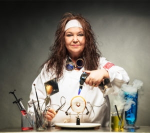 Malinda Julien is a commercial photographer specializing in Food Photography in Fort Worth, Texas, with Julien & Lambert Photo. She is the author of The Sugar Biscuit Journey & Butter Beans cookbooks, (available on Amazon) and thee host of Home Cooking Kitchen on YouTube™.


