


By Dave Montizambert
If you were to ask me what makes a great image, the first thing that comes to mind is lighting, light affects, mood, and emotions… more than most of us are aware. As a very lighting centric person, my choice of restaurants, cafes, and such usually revolves around their atmosphere, of which lighting plays one of the strongest roles. Throughout my career, I have been guilty of creating images that I consider to be magnificent because of the lighting, but fall short on concept!
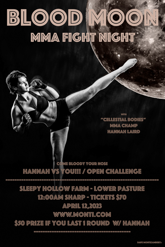
Case in point: I recently created a Mixed Martial Arts (MMA) Fight-Night poster featuring a friend of mine, Hannah Laird, who at a ripe old age of 16 is something of a MMA champ. The project began as an in-studio image I created of her doing a high kick. The pose creates a graphically interesting body shape, her expression creates tension, and the lighting over her body creates depth and drama. Even so, it is really just an action portrait, low on concept and high on boring to anyone who is not interested in her personally. The project with Hannah began with capturing her doing a number of action poses like this high-kick, all with no real concept other than “Scary Female MMA Fighter.” Needless to say, slapping down some text on this image didn’t really elevate it that much either. It needed something more.
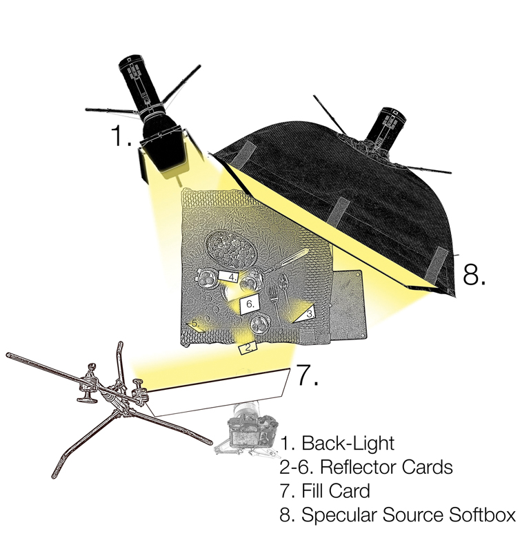
As you can imagine, I was feeling pretty inadequate with the results. What was I expecting? In my defense, I did put a lot of effort into lighting and getting the shot. The amount of variables at play, combined with trying to capture a fast-moving martial arts movement was crazy. Not only did everything have to be accurate, the image needed to have some artistic appeal in terms of Hannah’s form. It also had to be created in a very specific spot in space and time for the lighting. As you can imagine, it took a ton of directing from me and a ton of concentration from her to get the kick right and look good doing it! As a result of very little forethought, I had to develop a concept around the image after the fact to give it some pizzazz… not a great way to work!
To this end, I started to look at fight posters online. This really helped to get the creative juices flowing. Of the posters I viewed, most included the date for the fight. This triggered me to think about what else might be happening in the world in and around Hannah’s event. As it turns out, the date for Hannah’s fight night was also a solar eclipse. This got me to thinking about full moons, and celestial ceremonies late at night. Why not tap into this magic for Hannah’s Fight Night? This led me to include the moon with Hannah’s kick. The text for the poster helps tie the concept of moon and fighting together… hence “Blood Moon.” It also adds a graphic element. To be accurate, “Blood Moon” is poetic slang for a total lunar eclipse, not a solar eclipse. Even so, I figured that since Blood Moon is not really accurate terminology, I could apply a little poetic license and get away with it… probably only risking the wrath of the odd troll out there!
Perhaps my unwillingness to really develop a strong concept prior to the shoot was just plain laziness. After all, I suffer from chronic fatigue so maybe I can cut myself some slack here. It also occured to me that throughout most of my photographic career, I’ve been creating images for advertising, which means that much of the time I’m using/interpreting someone else’s concept, usually an art director or designer. In such cases, my artistic responsibility is in creating the set and the lighting plus capturing the moment.
But from now on, when it is all up to me, I’ll take a good long nap first and then hit the Internet for images as fuel for firing up a productive brainstorming session before developing a solid concept to play around. It is more than apparent to me now that it is easier to start with a strong concept. I should also add how important it is to bill the client for this conceptualizing. After all, this is a key part of the process and you should be compensated for it. There is more involved than simply clicking the shutter.
featuring a friend of mine, Hannah Laird, who at a ripe old age
of 16 is something of a MMA champ.
With the above in mind, what makes an image appealing? Is it great photography? Is it good compositing? Is it a clever concept? Or is it all of the above? I have seen great concepts with mediocre photography and still love the piece for its message or perhaps for its plain goofiness. Compositing has only become widespread among photographers since digital capture and its post-production potential. Today, so many award-winning images rely heavily on compositing and/or other manipulations in post. It is ever more difficult to win the eye of the public, and judges for that matter, with just plain, good old photography! That’s not just me whining. It’s hard, cold fact that I’m okay with… at least after a good kip!
I found just the right moon image for this fight night poster in my file of stock images. It was, however, really low resolution so it had to be up-sized a fair bit. But since it was to be behind Hannah, sizing it up was okay as long as I added some blur to it to made it look a bit out of focus. This solved the low-resolution problem and gave a greater feeling of depth to the composite. It is amazing what you can get away with when using softened low-res images as backgrounds since blurring them mimics shallow depth of field. The blur also hides the upsizing pixelation. There have been many times when I have used clients’ terrible, low-res smart phone images for backgrounds with good results!
Word of warning: Make sure that, after blurring the image, you apply some Noise to the image after the fact (from Filter menu in Photoshop I choose Noise > Add Noise… > Amount: 2 to 4% > Distribution: Gaussian > Monochromatic). Noise will hide any banding that might occur by visually breaking up unwanted hard transitions in what should be soft tonal gradations in the image. In the digital world, gradations of tone are not actually continuous like we see them in the real world but are represented digitally with steps of tone that are, hopefully, such small steps that they fool the human eye into thinking it is seeing continuous tone. When we do see a tonal gradation start to break apart, it is called “Banding.” Banding occurs when the bit depth is not high enough to create a finely incremented breakdown of tonal gradations.
 Dave Montizambert lectures internationally on lighting, digital photography, and Adobe Photoshop. He is also a published author having written two books on lighting and digital photography (www.montizambert.com ) plus numerous magazine articles on these topics in North America, Europe, Russia and Asia. Dave produces “DaveOnDemand” (www.montizambert.com) lighting tutorial based photo-training and also creates lighting & Photoshop tutorial DVDs for www.software-cinema.com & www.PhotoshopCAFE.com/video. Dave is available for lectures and workshops in your area and can be reached through www.montizambert.com.


