


by Tim Babiak
For most people, the first thing they learn about photography is exposure. As we learn about exposure, we learn that we are exposing for highlights – the brightest parts of the frame. Most of us have been admonished to “not blow the highlights.” While this is valuable education, for many photographers the learning doesn’t extend to include shadows. I remember teaching a workshop a few years ago and I asked the students – who were a great group of photographers – which camera settings we use to change the darkness of the shadows in an image. Of course, it was a nonsense question and the photographers looked at me with puzzled expressions. Yet none of them had given thought to controlling the shadows in their images.
Before we get into details about shadows, many photographers new to PPA print competition learn about a mistake known as “blocked up shadows.” Blocked up shadows are areas of an image where a Photoshop dropper would show a reading of 0,0,0 – the area is pure black. An experienced photographer would say this area lacks shadow detail which diminishes the quality of the image. When printed, an area of blocked up shadows appears as a black blob. So, a first lesson is to avoid areas of blocked up shadows in an image – and we will cover how to do this later in this article.
We can consider the tonal range of an image to have three general areas. The highlights are the brightest parts of an image – typically the brightest 25%. The shadows are darkest parts of the image – typically the darkest 25%. The midtones sit between the highlights and the shadows and are the middle 50%. For most images, the highlights are the attention getters – they’re the first thing we notice about an image. A good photographer will take great care to only have highlights where the photographer wants to gain attention – an area known as the center of interest. Highlights in other places of an image distract from the center of interest so a good photographer will take great care to avoid distracting highlights. After the highlights gain the attention of the viewer, the midtones tell the story of the image. As a viewer spends more time with the image, the eye makes its way to the shadows. A masterfully created image will have shadows that are carefully placed and show subtle details about the image. It’s during this exploration of shadows that the viewer becomes interested in the image. Shadows are the complement of light and great shadows make great images – read on to learn more.
Depth of Shadows (ratios) – One of the aspects of any shadow is its darkness. New photographers tend not to be deliberate about the darkness of a shadow. In fact, when we start on our photography journeys, the shadow just seems to be whatever darkness it is. Yet, a skilled photographer is as deliberate about the darkness of the shadow as he or she is about the brightness of the highlights, image sharpness or any of several technical details of the image. At first, most people notice the darkness of shadows in a qualitative manner – some shadows are darker than others. As we develop our photographic skills, we see the need to quantify the darkness of shadows. The classic way to quantify the darkness of shadows is called a lighting ratio. For example, an image in which the highlights are twice as bright as the shadows is said to have a “two to one” or 2:1 lighting ratio. As the numbers increase, the shadows get darker. So, a 4:1 lighting ratio would have darker shadows than a 2:1 lighting ratio. Lighting ratios are not only for image lit by studio flash – lighting ratios exist in all images despite the current trend to declare that there’s no need to pay attention to lighting ratios. One common error is to think that lighting ratios are about the brightness settings on various studio lights. One light may be at half its brightness and another be set to one-quarter brightness but that doesn’t mean the result will be a 2:1 ratio. The ratio is always a result of the light falling on a subject or object.
The math behind lighting ratios can be challenging at first. A studio environment for portrait photography in which only flash yields the exposure (the ambient light does not render in the image) is a nice, controlled way to understand lighting ratios. In this case, the photographer may use two lights – a main light and a fill light. The main light is placed to the side of the subject and the fill light is placed directly behind the photographer. Using a handheld incident light meter, the photographer can measure the quantity of light falling on the subject – first metering each light independently then metering the two lights together. A common starting point is to adjust the light output of both lights so the main light meters twice as bright on the subject as the fill light. A common mistake is to quickly conclude that the lighting ratio is 2:1. In fact, we must determine the brightness of the highlight side of the subject’s face. We know that the highlight side of the face receives two units of light from the main light and a second unit of light from the fill light – yielding three units of light on the highlight side of the face. The shadow side of the face receives no light from the main light and one unit of light from the fill light – yielding one unit of light on the shadow side of the face. The resulting ratio is 3:1.
While we can understand conceptually that a 5:1 ratio has darker shadows than a 3:1 ratio, a skilled photographer needs to understand how images look with each ratio. While numerous diagrams have been published showing various lighting ratios, there’s no substitute for setting up lights, doing the photography and reviewing the results that various lighting ratios yield. This practice is invaluable in developing the skill of translating clients’ intentions (dramatic, light and airy, moody, etc.) to specific results.
While a controlled photography studio is a great place to learn these skills, lighting ratios carry into every facet of photography including available light and one-light photography. As a photographer becomes aware and skilled with lighting ratios, he or she discovers that there are situations with multiple lighting ratios. For example, a portrait photographer working outdoors may establish an intended lighting ratio on the subject’s face and notice a different lighting ratio in the background. This observation is important as lighting ratios with more contrast (higher numbers) tend to attract the eye. So, a contrasty background can distract from the subject of the image.
Any discussion of lighting ratios begs the question – are they really necessary? Can’t a good photographer just do it all by eye? With photography, anything is possible and yet, an artist knows their brushes. A mastery of lighting ratios allows the photographer to be deliberate and repeatable with their work. Imagine the terror a simple client request could invoke – “we loved the photos you did for us last year. Can you do the same thing for us this year?” Or how about, “We would like to use you instead of our former photographer. We need the photos to look the same.” Another request might be, “You’ll be on a team of several photographers taking headshots of our employees. We need all of the photos to look the same and match the work of the prior team.” A mastery of lighting ratios enables the professional photographer to meet these requests with confidence.
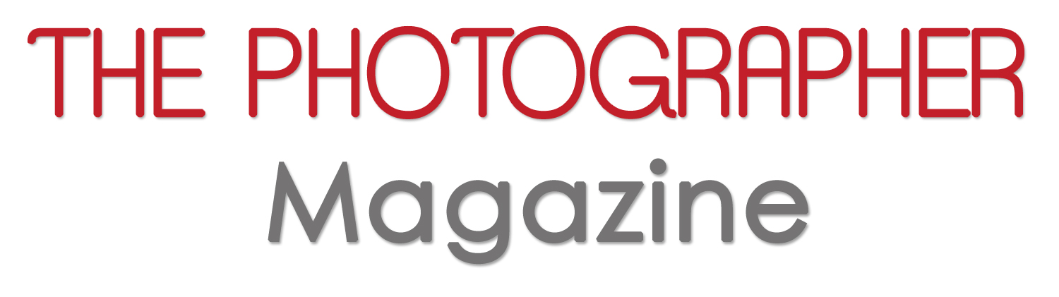
Shadow Patterns – In addition to the darkness of shadows, portrait photographers care about the patterns that shadows cast on the subject’s face. Typical patterns fall into several categories – flat, loop, horror, split, Rembrandt and butterfly. There are many sources available describing these patterns in more depth. The best way to learn how to make these patterns is to create them in practice sessions in dimly lit spaces.
Broad and Short Light – Broad and short light are variations of the three asymmetrical lighting patterns – loop split and Rembrandt. In a broad variation, the highlight side of the face is presented to the camera while, in the short variation, the shadow side of the face is presented to the camera. Broad lighting makes the face look wider and can present a bold appearance for men. Short lighting makes the face look thinner and accentuates bone structure.
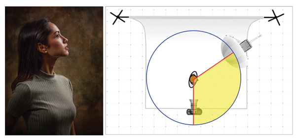
Most portrait photographers tend to be drawn to broad lighting and can find creating short lighting more challenging. Through my workshops, I’ve developed a simple method to create short light called “put the nose in the magic slice of pie.” To start, imagine the subject standing in the middle of a circle or “pie.” Then, make two cuts to create the magic slice of pie. The first slice is from the subject to the camera. The second cut is from the subject to the main light. As long as the subject’s nose is in the “magic slice of pie,” the subject will be short lit. Any time the nose moves outside the magic slice of pie, the subject will be broad lit.
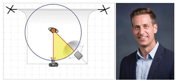
In group photos, one person could be short lit while another is broad lit. Each pattern is created due to the position of the main light relative to the position of the subject’s face. As the subject moves, the skilled photographer will move the main light to retain the shadow pattern. When photographing a subject in profile, to short light the subject, the main light is to the side and behind the subject. The result is the subject presents the shadow side of their face to the camera – typically a much more compelling result compared to broad lighting the profile.
Quality of Light – The phrase “quality of light” is used to describe the transition between highlight and shadow. Many photographers use words like “hard” and “soft” to describe the quality of light. Hard light is seen outdoors on a clear, sunny day in which shadows on the ground are crisp. Soft light is seen outdoors on an overcast day. With soft light, there is a gradual transition from highlight to shadow.
Hard quality of light is created by relatively small light sources while soft quality of light is created by relatively large light sources. The sun provides a great example. Although the sun is a massive star, due to its distance from the Earth, 93 million miles, a clear, sunny day yields hard light associated with relatively small light sources.
As photographers learn about portrait photography, most gravitate toward soft light – and, indeed, soft light is beautiful. As a photographer gets more skilled, quality of light is simply another tool to use when crafting a portrait. Quality of light can be hard, soft, or in between and be used to create beautiful images.
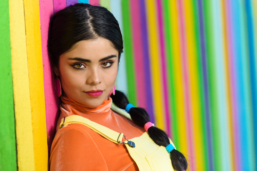
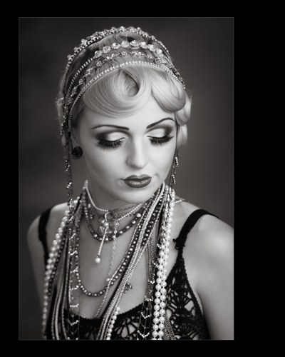
As we delve into quality of light, we tend to think of it as a singular characteristic. Many times, the quality of light can vary within an image even if the image has a singular light source. The image of Kelly (above) demonstrates this phenomenon. Kelly is lit by a 15” beauty dish which is a moderately small light source. The nose shadow is hard as is the shadow cast by the garment strap and buckle. The right cheek shadow transition is very soft due to the curvature of the face. The shadow cast on the colored fence is between hard and soft. Careful placement of light and subject yielded these results.
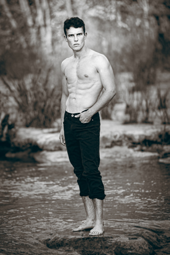
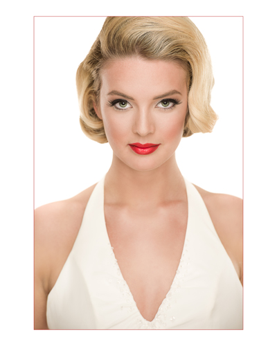
Texture – Texture in skin or an object can be revealed or hidden using light. To see texture, we need to see the mini-shadows cast by the peaks and valleys of the texture. Light that rakes across a texture accentuates the texture while light that is directed perpendicular to the texture lights evenly hiding the texture. Hard quality of light tends to reveal texture more than soft quality of light. The portrait photographer may use this knowledge in different ways depending on the objective of the image. A large light source might be used to reduce skin texture. In the image of Michael (right), flash was used to light his face but the open sky above lit his physique raking across his musculature accentuating his physique.
As we learn about light, we quickly realize we must also master shadow. All of the characteristics mentioned in this article are part of virtually every portrait. The skilled portrait photographer understands that deliberate use of light – and shadow – make a great portrait. While highlights are important, interest lies in the shadows.
 Tim Babiak, M.Photog.Cr., CPP, is a full-time photographer in Austin, Texas. Tim is a PPA Master Photographer, Photographic Craftsman and Certified Professional Photographer. He has served for many years on the Board of Directors of the Austin Professional Photographers Association and is a two-time recipient of the Photographer of the Year award from the Austin Professional Photographers Association.
Tim is also a two-time Bronze Medalist in PPA’s International Print Competition. To see more of his work, follow him on facebook at: www.facebook.com/exquisitephotoaustin/.


