


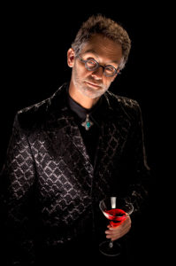
by Dave Montizambert
Texas School Instructor
Trying to print night scenes with all their dark subtleties is often more troubling than a trip to the dentist. Many of these rich nuances will appear beautifully depicted on screen, but will get “lost in translation” when printed. Reflective mediums such as photographic prints or lithographic re-productions like this magazine, cannot possibly represent the range of contrast that transmissive mediums can, mediums such as properly calibrated and profiled monitors of decent quality. If you think about it, light reflecting or bouncing off a surface cannot be as intense as light “glowing” out of a surface.
The image above was created during one of my lighting workshop demo’s at last year’s “knock-down, drag-out, leave no class-attendee standing,” Texas School 5 day workshop. At this workshop (one of the biggest in the world, so no pressure there), I was showing off my lighting techniques for dramatic B&W figure studies. Creating complex lighting on-the-fly while using unfamiliar gear and explaining the principles involved of what you are doing means that you cannot give your full attention to the actual photo shoot and model before you. However, the creation of this image was a lot easier thanks to the incredibly photogenic physique of my subject, Taondrae Caldeleught.
Even so, the situation was far from perfect and I was plagued with several technical issues such as the flash triggers that worked intermittently and in a very schizo manner due to electronic interference, as well as a never ending barrage of questions. I don’t blame them because they were paying a pretty penny to be there. Besides, I love questions. It gives me a chance to be the big-shot… pontificating ad nauseam. With just an hour or so to do a three hour shoot, the stress was on.
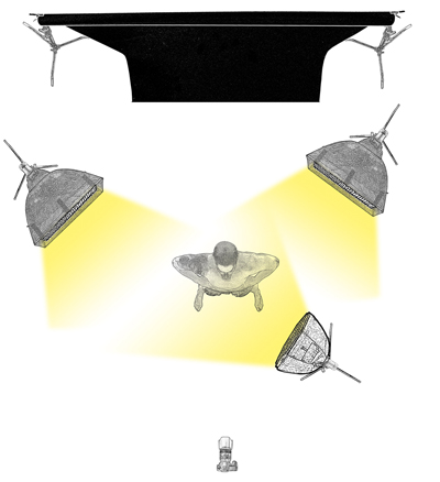 Shoot Specs for B&W Body Light Sculpting:
• Camera Exposure: F 8.0 at 1/125th at 100iso.
• Camera: Full frame mirrorless.
• Lens: 70-200mm set to 70mm.
• Camera Distance: 7.5 feet from subject.
• Camera Height: 3.5 feet from floor to imaging sensor.
• Background Distance: Black 9 foot seamless backdrop paper positioned 9 feet behind subject.
• Main-Light Source: 500W mono-block strobe fitted with a 2 foot Octa-box with 50˚ soft-grid was placed 3 feet from subject & sat 6.5 feet from floor to strobe tube.
• Main-Light Source Brightness: For this dark look, I typically underexpose this main-light 2 to 3 stops below camera setting using an incident meter reading with back of meter against subject, dome pointed at source.
• Separation Light-Source Distance – Two 500W mono-block strobes fitted with 1×4 foot strip-light light-banks with 50˚ soft-grids were placed vertically & slightly behind subject on both right & left sides, each sat 3 feet away from subject. These 2 back-light sources sat 2.5 feet from floor to bottom of strip-light.
• Separation Light-Source Brightness: These two back-lights were set to 1.5 stops below camera setting using an incident meter reading with back of meter against subject & the meter’s dome pointed at source in question.
As always, I shot tethered, porting the RAW files directly from camera to computer using a Tethertools rig. I usually create my lighting to my RAW process settings rather than the other way around. This is a more efficient way of working and renders better quality image files. Interestingly enough, that this is the way I had to work in the film days, before digital. Unlike B&W negative films, color transparency film (slide film), which was my main-stay, had very little processing latitude. It could not be effectively altered with variations in processing. Doing so would skew the film’s color wildly, making it unsuitable for all but the most avant-garde imagery. This meant that I had to create my lighting to the range of contrast created by that film and processing method.
Once the images were ported over from camera to computer, they automatically showed up in Lightroom with my custom B&W preset settings applied to the on-screen preview, allowing for a somewhat accurate rendering of my lighting. For the sake of the workshop participants, my computer was tethered to a projector so that, as the images appeared in Lightroom, they also showed up bigger than life on the projection screen. To my immense joy, the first image looked absolutely amazing on the big screen. What a relief after all the technical trauma!
I almost got a mouth full of cavities from the stress which, by the way, is a little known dental fact that stress can cause cavities – I thought that might be appropriate to mention here since I seem to have a bit of a dental theme going on in this article. Anyhow, this happy outcome should have been no surprise because I had planned out this shoot in my head long before the session started. Then, during the shoot, I metered it to death to ensure all was perfect. Still, when things you normally count on suddenly seem to stop working, you lose confidence, creating doubt in yourself and your knowledge.
Upon completion of the shoot and with the help of the workshop attendees, we picked out our favorite image of Taondrae and made a series of inkjet prints of it. The first print looked pretty decent when viewed inside a print viewing booth designed to provide near ideal viewing conditions (although I find them a little too bright if you are trying to represent typical viewing conditions of clients). The specular highlights (sheen) on our more-than-buff subject, contrasted beautifully to his very dark underexposed flesh, even though they weren’t all that bright (high 20’s to low 70’s with Lightroom’s 0-100% scale and 53 to 180 in the 0-255 levels’ scale of Photoshop or Adobe Camera Raw). Either scale puts them in the upper quarter-tone to upper mid-tone range, making these “shiny-bits” kind of dim for what specular sheen can be, but not unusual for night scenes.
Interestingly enough, these specular highlights actually appear brighter than the above densitometer readings suggest due to Simultaneous Contrast. For instance, Simultaneous Contrast makes a mid-tone against a dark-tone appear visually brighter than it really is because your visual system is always trying to pull tones apart, making dark tones darker and light tones lighter, so we can better discern detail to help us identify what we are seeing. But, if you look at this image or any predominantly dark image under less than optimum viewing conditions such as most people’s home lighting, things will start to block-up, losing a lot of those beautiful bits of subtle specular detail, making the image look dark and a bit lackluster.
Conversely, an image such as a typical portrait is made up of a lot more mid-range to highlight tones rather than predominantly dark tones of this night scene of Taondrae. This makes them more flexible in terms of viewing conditions. Taondrae’s nighttime portrait and all other images like it have a very narrow range of lighting conditions where they look okay. But, having said that, even a forgiving image like the typical portrait image I mentioned above has an optimum viewing brightness that makes that image it’s very best.
I remember years ago dragging a couple of tungsten lights and my incident light meter to my local photo lab who were printing images for PPA competition in order to simulate the lighting conditions under which they would be judged. We were provided the exact brightness level (f-stop, shutter speed, and ISO) by PPA and I recall having to do this several times over a couple of days before getting what I wanted. It was a hassle but it paid off and one of those images went into the PPA Loan Collection. Profiled workflows have alleviated a lot of this in the digital world.
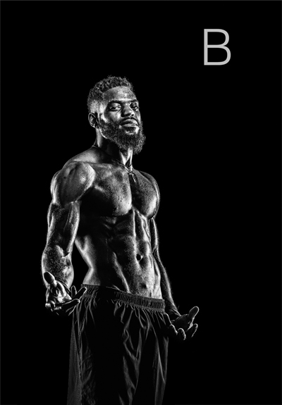
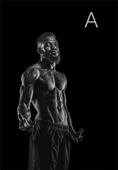
Two versions of the image of Taondrae: Version A is printed straight out of Lightroom using the B&W preset, with no further tweaks in Lightroom or Photoshop employed at the time of lighting. Version B is the result of applying a contrast enhancing curve.
As a viewing exercise, let’s view the side-by-side comparison of Taondrae above. Version A is printed straight out of Lightroom using the B&W preset, with no further tweaks in Lightroom or Photoshop employed at the time of lighting in front of the class. Now look at version B where we see the result of a contrast enhancing curve applied. This curve has stretched the image’s tonal range upward, brightening the specular highlights while leaving the darkest tones alone, making the image more “punchy” (high contrast) but less subtle. Version B holds together better under darker viewing conditions than version A, making it more versatile and an all-around safer bet.
I like version A best when viewed on screen or when printed and viewed in my print viewing booth. The look and feel is less harsh than B. But version A doesn’t do so well under my room lights. Try looking at the side-by-side images in outdoor daylight, then inside under normal indoor room lighting, then once again under even darker indoor room conditions. Which one do you like best and under which conditions? The choice is somewhat subjective but, generally speaking, I find that the majority of viewers agree.
This is not unlike those TV ads where a high percentage of dentists agree on something. You know… “Nine out of ten dentists agree that brushing your teeth has nothing to do with photography” or “eight out of ten dentists agree that brushing your teeth between print making promotes stronger healthier teeth and fresher breath.” Such photo-dental revelations! So, when sending my work out to be printed at a lab or on a printing press, I print it on my photo-quality inkjet printer. Then I view it in my viewing booth as well as in daylight and outdoor lighting. Finally, I view it under room lighting in my studio/home/office before tweaking the image in Photoshop with a curve to make it work in all three conditions. Obviously, this is a bit of compromise. But at least I walk away with something that works… and with fewer cavities!
 Dave Montizambert lectures internationally on lighting, digital photography, and Adobe Photoshop. He is also a published author having written two books on lighting and digital photography (www.montizambert.com) plus numerous magazine articles on these topics in North America, Europe, Russia and Asia. Dave also creates lighting & Photoshop tutorial DVDs for www.software-cinema.com & www.PhotoshopCAFE.com/video and authors “Dave On Demand” (www.montizambert.com) lighting tutorial based photo-training. Dave is available for lectures and workshops in your area and can be reached through www.montizambert.com.


