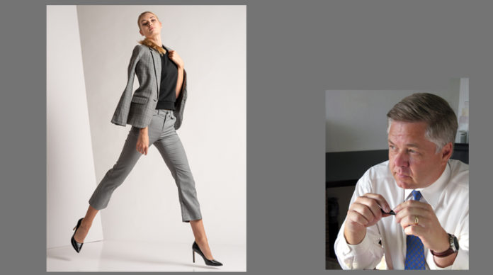
by Steve Ellinger
One of the things that always amazes me is the enormous volume of information available on the internet on any topic imaginable. Photography is no exception, and a random query on any photography related subject yields a massive source of information. But is the information good, accurate, or reliable? There is a popular saying that Abraham Lincoln stated: “Don’t believe everything you read on the internet.” Well, in this case he was right! Advice on the “right” way to crop photos is, shall I dare say, mostly wrong and outdated. That’s blasphemous, say the self-proclaimed experts who follow the rules and eat Wonderbread.
Most of you know me and my writings and know that I shoot fashion and agency testing exclusively. Nothing else. And in MY genre of photography, the bland, boring, Wonderbread style of photography that is typically taught will get my work rejected, round filed, or placed in the black hole of the delete folder. Nothing helps convey a final product like the PROPER crop.
We have all heard the instructors or read the articles that state: don’t cut off limbs, don’t give the subject a crop haircut, crop at eye level, crop in camera, use the rule-of-thirds, use the golden ratio, don’t center the subject, tell a story, crop consistently, and on and on. Ok, I’m going to say it now, BAD ADVICE! That is unless you are doing the “line them up like cattle and press the shutter, one after another, and another, and another.” Enjoying that slice of Wonderbread?
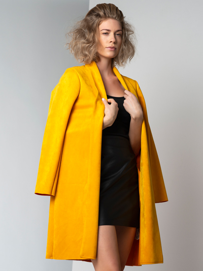 Seldom is the reason WHY we crop taught. Let’s take cropping to a much more professional level. In my line of photography, the crop outcome and technique is used to typically do one of two things, promote the model, or promote the fashion. It’s best not to confuse the two, and as a photographer knowing how to do that is critical. Fashion should not be boring, and neither should the images be that are used to sell the fashion. Style, creativity, proportion, scale, line, texture, symmetry, etc., are just a few of the design elements that the fashion AND the photography thereof should contain.
Let’s look at how a proper fashion photo should be cropped. As is with most everything, psychology plays a part in what we do, and why. Properly cropped, a fashion photograph will draw one’s eye and emotion to the ward, or whatever fashion items is being promoted. Do this by cropping very tightly TO THE ITEM BEING SHOWN. It is not to feature the model, or the background, or the nice rock out-cropping or whatever. I am still to this day, “reminded” by well-meaning PPA experts that “Ellinger, you cut the tops of their heads off too much, or you cropped too tightly, or leave some real estate around your subject.” With all due respect, that is fine for weddings and senior pictures, but fashion is a very different ball game, practiced by few, and frankly those rules are just wrong. A very tight crop (yes, even giving the subject a haircut) draws the eyes and emotions to the fashion being presented. An off-center crop adds the dynamics that fashion design needs. The rule-of-thirds? How about the “rule-of-sixty fourths”? Why not? We are supposed to be artists. THINK like an artist with the camera!
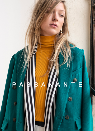 The second approach in fashion and agency testing is cropping and composing to promote the model and is less about what she is wearing. Often agencies use simple comp-card images that primarily show the model as the main subject to potential clients for ad campaigns, etc., to see if the client likes the models overall look. This is done by showcasing the model’s strongest attributes, such as face, legs, eyes, or whatever is the strong point, and adding dynamics to the pose with movement, etc. Models need to be able to move fluidly, and I need to show that even in a still photograph. In promoting the model, I do not want a busy background, no clutter, mottled backgrounds, no fake bookshelves (i.e. as in the unlevel Olan Mills backgrounds I still see), and certainly no distractions like smoke or obviously cheesy effects.
Pure and simple is what you need. Mind on the model, folks. It is amusing to see the amount of clutter and distractions on social media by well-trained photographers who clearly know how to technically take the picture with perfect PPA lighting, etc., but fail miserably in background and crop. The photographer only sees the technical aspects of the photo, the model only sees herself, and the stylist only sees the fashion she designed or created. A good fashion and agency testing photographer must see everything and successfully conduct the orchestra of visual effect.
By now you are thinking, “I only do senior photos and weddings, so none of that applies.” My clients prefer what they always see.” Let me suggest that if you take your already excellent technical skills as a photographer (and I gather that if you are reading this publication, your skills ARE excellent), apply the proper creativity and purpose, and think like an artist and designer, even YOUR type of photography can jump to the next level!
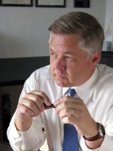 Steve Ellinger, CPP is a fashion and agency testing photographer, speaker, educator, and practicing architect in Abilene, Texas. Steve will be teaching his class: “The Fashionable Side of Photography,” at the Texas School of Professional Photography in April.


