


by Bob Coates
M.Photog.M.Artist.Cr., CPP, EA-ASP
Artists can be picky when you photograph their work for reproduction. And, who can blame them? Color is their world and any deviation from the vision can change the emotion of the art. I’ve been working with a way to shoot flat art that simplifies the set-up and gets you better color than other ways. No longer is there a need for polarizing filters and busting butt trying to get even light across the field of the artwork by trying to use 45 degree angles with lights pointed at the art… See the lighting diagram for the set-up. Here’s how it works for me…
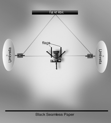
The process – Take a measurement of the art on a diagonal from corner to corner. The lights should be at a distance and set as an equilateral triangle that is longer than the longest dimension of the art to be photographed. If you have really large art you can stack another set of umbrella lights over the first to get larger coverage.
Lights on umbrellas should be facing the CAMERA. We are lighting the flat art with the spill from each umbrella. This makes it extremely easy to get the light falling on the art to 1/10 of a stop over the entire surface with virtually no effort and little to no reflections.
Set up flags so that the light doesn’t flare the lens since the lights are pointing toward the camera. By the way, the camera can be anywhere along the center line. It doesn’t have to be in between the lights. It can be forward or behind the lights. That is either closer or further away from the art so long as it is centered.
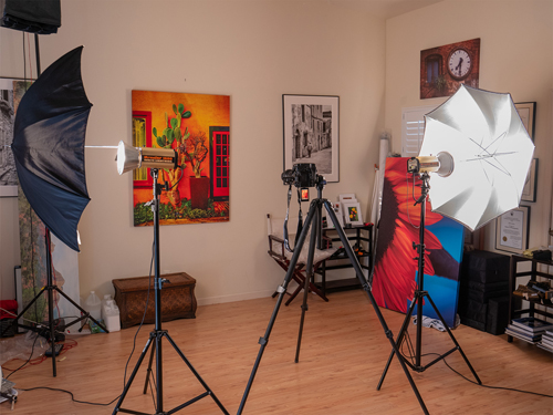
Speaking of the camera, I’ve been using the Olympus OM-D E-M1 Mark III. Using the High Res Shot Mode an 8o MP file size is possible. The camera captures eight images offset by about 1/2 pixel and combines them. What makes this possible in the studio is a setting that allows for a delay between each exposure. The delay allows time for the flash to completely recycle between the eight exposures.
Camera lens choice – One thing to be careful about is lens choice. Ideally a tilt shift lens or very flat lens with no distortion is best. Use a level on the artwork. Level your camera as well to make sure it is on the same plane as the art. Spending time here will save you lots of hassles once you get to the computer.
Using a wide-angle lens can lead to some barrel distortion. If you don’t do enough of this work to buy specialty lenses, use the flattest you have. Adobe Camera Raw has a lens correction tool that can get you very close to correct and square. Check that the image is perfectly square by pulling down some guides. A VERY small amount of Transform Tool using warp can get you back on the straight and narrow for small adjustments.
All that said, I am having great success with the Olympus M.Zukio 12-60mm f/4.0 Pro lens. This lens is spot on clean, square and accurate. The zoom is true at all focal lengths and makes it easy to fill the frame with the art without moving the camera or tripod.
Two ways to shoot for correct color – Very necessary for correct color is to use the proper tools. A light meter is essential. Confirm light meter readings to ensure the light is even across the art. Use that reading on your camera with an Expo Disk. Make an exposure with the Expo Disk in place with the light meter settings from the artwork’s position and use that exposure to set a custom white balance on your camera.
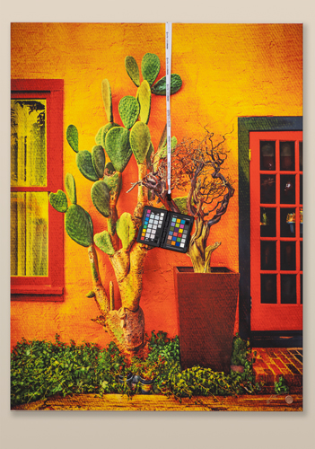
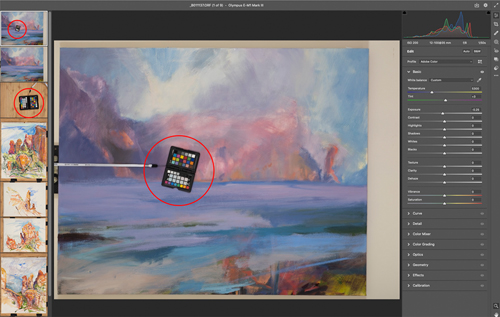
My current preferred method is to hang a ColorChecker Passport Photo 2 over the art. I have a nail above where artwork hangs to help facilitate this. Each time I shoot a new session or change the lighting in any way a new image of the chart is made. Color correction is accomplished using the eyedropper in Adobe Camera RAW by clicking on the neutral swatches from the chart. More on additional color correction below. You can also invoke software to help adjust color using the checker but I’ve found my workflow with Adobe Camera RAW to work well.
Art under glass? Work a little harder. – If you are shooting artwork with glass or with highly specular highlights from the paint or glaze set up a black background behind the camera and cover the tripod with black velvet. Get out of the way and trigger the camera with a remote. There will be no reflections or any light for the artwork to “see.” Hence no glare or specular hotspots with which to deal in post.
Note that in processing you will need to account for the color of the glass. There is usually some skew of color, usually toward green, in the glass. This can be countered by an adjustment toward magenta to counter it. The only time this will not be a factor is when museum glass is used. That’s rare to see because of the cost of museum glass.
Before deciding color when viewing artwork be sure to use a color correct light source. I use a Falcon Eyes F7 12-watt pocket-light panel with a Kelvin temperature around 5500K dialed in. I use that light because the Color Rendering Index is 96 plus which means the light will not shift with a magenta or green cast.
Adobe Camera RAW for processing – Adobe Camera RAW has become a powerhouse for processing images. When it comes to artwork there are a couple specific processing palettes I’d like to mention.
The first is the Basics palette. I select all images in a series with the ColorChecker image highlighted. Then I check exposure using the Histogram and make any needed adjustment. Next, using the White Balance Tool, click on a neutral swatch on the chart. Color and tone is looking pretty good at this point. Depending upon the type of paints used, there may be variations of color due to phosphors, metallics or neon. These colors will need individual attention which leads to the next palette.
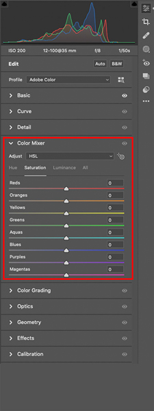
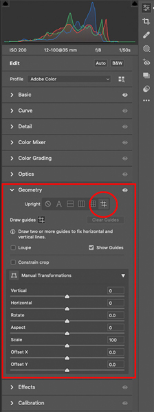
The Color Mixer Palette is a godsend. It allows you to adjust eight different individual colors by Hue, Saturation and Luminance. You can tweak all of those settings without having to make selections of the colors or tones. I can’t begin to tell you how powerful this feature is. Last but not least is the Geometry Palette. No matter how careful you were in leveling your image and your camera it can be off by just a touch. This palette lets you get the image perfectly square so when it’s time to crop out the background you can pop on the crop tool and be done lickity split.
Final thoughts – Since I have been using this system, I no longer have issues with shifts in color from hot spots or polarizing filters. Most important, no more fighting with artists about getting the ‘right’ color. There were always problems before, no more. Try it you’ll like it!
 Bob Coates resides in the beautiful area of Sedona, Arizona, with his best friend and spouse Holly. You can see more of Bob’s work at bcphotography.com and coatesart.net. Read more photography articles by Coates at successful-photographer.com
and photofocus.com.


