


Two Ways to Boost Color
Rob Hull
One question that is often asked when we talk about digital processing is “what’s the difference between Vibrance and Saturation?” In Lightroom and Photoshop, you find the vibrance and saturation adjustment sliders in the Presence section of the Basic panel.
First let’s look at what you’re doing when you adjust colors. We use a simplified color model to help explain this. The model illustrates Hue – a fancy term for the color, Saturation, and a brightness Value. Think of the center axis being brightness from black at the bottom to white on the top. Around that axis is the hue, or color. It begins with the primary red color at 0° and circles the lightness axis, passing through yellow, green, cyan, blue, and magenta.
Beginning in the center and radiating out is the Saturation. Color saturation represents the intensity of the color. Highly saturated colors are often described as vivid, rich and bright. Conversely, colors with less saturation appear to be washed out and pale. With no saturation at all, you’re left with either black, white, or some tone of gray.
If you take a slice of that cylinder, you get colors that share a particular brightness. In the center of that slice, you have no color. It’s a value along the grayscale. But, as you move out from the center, you add saturation to a specific hue and brightness. Both the vibrance and saturation sliders adjust the saturation value of a color which pushes the color value either closer to the center axis (less saturation) or farther away (more saturated).
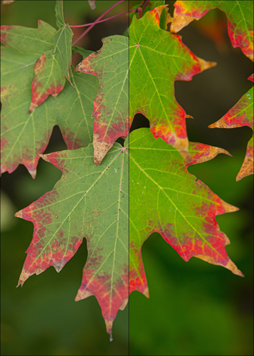
ADJUSTING SATURATION – When you make a global adjustment to saturation, you tell the computer to adjust the saturation of every pixel the same amount, regardless of the original color value. This can create problems when you have a mix of relatively saturated colors and unsaturated colors in the same image. If you add too much saturation, you can lose details in your image. Too much saturation in skin tones can leave someone with orange and unnatural looking skin.
ADJUSTING VIBRANCE – Vibrance is a “smart” adjustment to saturation in your images. It’s an intelligent tool that selectively saturates colors in your image. Colors that are already well-saturated receive minimal adjustment while more muted colors are adjusted more vigorously. Also, the vibrance adjustment tries to protect skin tones. You can make green foliage pop and still keep proper tones on someone’s face.
If you slide the Saturation slider all the way to the negative side, you remove all colors in an image. Essentially, you’ve made a B&W image. If I do the same thing with the Vibrance slider, you’ll find that there is still some color remaining in your image which is just perfect for some images.
WHICH TO USE? – Adobe Photoshop, Lightroom, and Camera Raw, all have both a saturation and a vibrance slider.
Once the vibrance slider was introduced, my use of the saturation slider for global adjustments diminished greatly. Today, there are very few photos in which I add a global increase in saturation. I do like to decrease the saturation in many images where color is not important in the story that I’m telling. But even there, I often like to use the vibrance slider.
Any images with people tend to look better when you use vibrance adjustments. If you’re a Capture One user, you may wonder why you can’t find a vibrance slider. Simply put, Capture One handles color editing a little differently.
 In Capture One’s Exposure tool or Basic Color Editor, the saturation slider works much like Adobe’s Photoshop product line. It is an “intelligent” adjustment, meaning that saturation is changed in a non-linear fashion. Skin tones and areas already highly saturated will not be affected as much as areas with low saturation.
If you switch to the Advanced tab in the Color Editor, all pixels in your image are treated the same. Thus, your saturation adjustment is now linear, changing both saturated and non-saturated colors equally. This is like using the saturation slider in your Adobe products.
Controlling Your Adjustments – It’s important to remember that you’re not limited to global adjustments in color saturation. Both Adobe products and Capture One offer several options to target your adjustments. This can be done via a mask or targeted to specific color ranges.
Take time to learn how to use the features in your software. Practice and be creative – you can’t hurt anything.
 Rob Hull and Tony Corbell will be teaching a class, “Between Light and Shadow”, at Texas School 2023. This class explores the three key elements that comprise light – the most fundamental ingredient in any photograph. Learn more about their class at: TexasSchool.org.


