


by Rob Hull
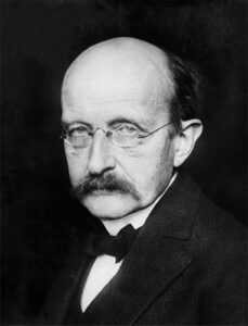 White balance is one of the most fundamental controls you have on your camera and in post capture editing software. But did you know that the groundwork for white balance in digital photography was laid a hundred years ago by German theoretical physicist Max Planck. Planck was a brilliant scientist who won the Nobel Prize in Physics in 1918. He is best known for being the originator of quantum theory.
In the late 1800’s, Planck was commissioned by electricity providers to help them determine how to get the brightest light from a light bulb with the minimum amount of energy. To do this, Planck studied black body radiation which resulted in a model that expresses the color of light based upon the temperature of a theoretical black body. It is this model that is the basis for white balance adjustments today.

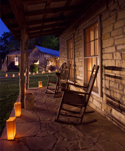
As the temperature of the black body increases, it begins to emit a visible light – just like the heating element on an electric stove. At about 1500° Kelvin, the radiation emitted becomes visible to our eyes and is a reddish color. As the black body gets hotter, the visible colors shift, moving through a spectrum of warm reddish colors, through white light, at about 5000° Kelvin, and ending in the blue portion of the spectrum somewhere above 15000° Kelvin.
Sound familiar? Your white balance adjustments are also based upon Kelvin color temperature with white daylight being about 5500° Kelvin. The white balance slider in Lightroom runs from 2000° to 50000° Kelvin.
Now, it’s important to remember that color temperature does not define all visible colors. It only considers light that behaves like the theoretical black body.
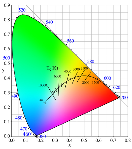
In 1931, the International Commission on Illumination (CIE) published a color model that is called the CIE 1931 Color Space which illustrates all the colors that are visible to the human eye. We can plot all the colors that are defined in Planck’s color temperature theory within this color space and the result is called the Planckian Locus.
A locus is just a fancy mathematics way of saying points or a line on a graph. Look at the CIE Color Space illustration and you can see the Planckian Locus plotted on the graph. This line corresponds to the colors that can be adjusted using a color temperature slider.
When you adjust the white balance temperature slider, you are effectively shifting the image colors along the arc of the Planckian locus. This works great for the amber colors in incandescent light bulbs or the blues in open shade. If your image has a purple cast from a neon sign, you can’t fix that with white balance.

But what about the white balance tint slider, you may ask? In Adobe Camera Raw and Lightroom, the white balance adjustment also includes a Tint slider. You’ll notice that the tints are green to the left and magenta to the right. This helps you fine tune your white balance, allowing for an adjustment that can deviate a bit from the temperature curve. It’s very helpful to shift out of the greens of a fluorescent light.
It’s ironic that the way we describe the colors that fall along the Planckian locus emotionally seems to be in opposition to the color temperature. The lower temperature light is described as “warm” light while the higher temperature light is considered “cool”. Even with roots in quantum physics, the color of light is still subject to human perception, with one foot in empirical science and the other firmly planted in psychology.
So, next time you are adjusting your white balance, you have a German theoretical physicist to thank. Thank you, Max.
 At the Texas School Professional Photography, Rob Hull teams with Tony Corbell in a most informative class titled, “Between Light & Shadow.” Rob is from Coppell, Texas, and has offered commercial, portrait, and freelance services for over 20 years. Learn more about Rob at www.GreatPhotography.com or go to www.TexasSchool.org.


